A connection between people, places and different visions.
A system that only takes shape when things are brought into relationship.
We started at the beginning, by creating a new identity for this local, tangible and visionary project.
It needed a narrative and the right value to be given to it.
People, territories and businesses do not remain the same when they connect. They influence one another, cross-pollinate and grow. This is the vision of Fondazione 1001.
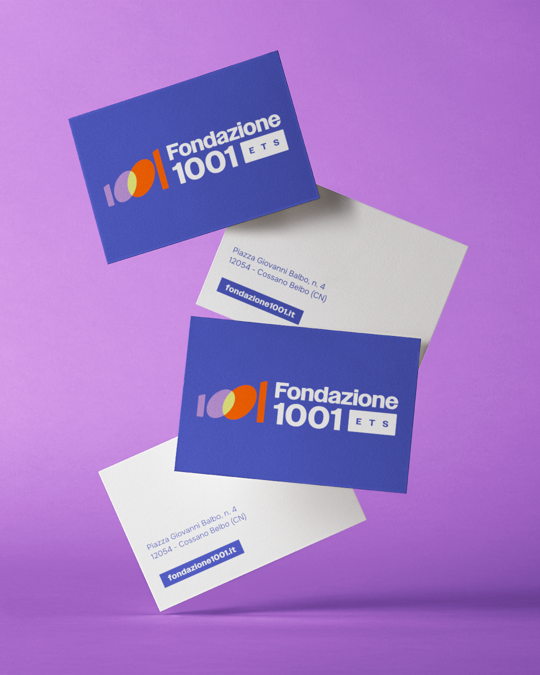
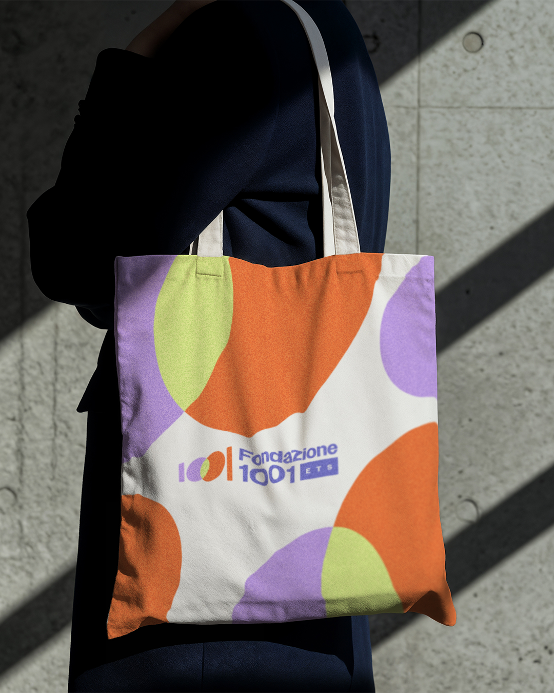
Fondazione 1001 already had a clear direction. What was missing was a language capable of making it visible. The objective was to build an identity and communication system able to:
represent the value of the community
make the Foundation’s role recognisable
present valuable projects to the local social fabric
build a strong positioning towards institutions and stakeholders
This was not simply about designing a visual identity. It was about giving form to a way of being and acting, to a territory’s desire to grow through the value of sharing.
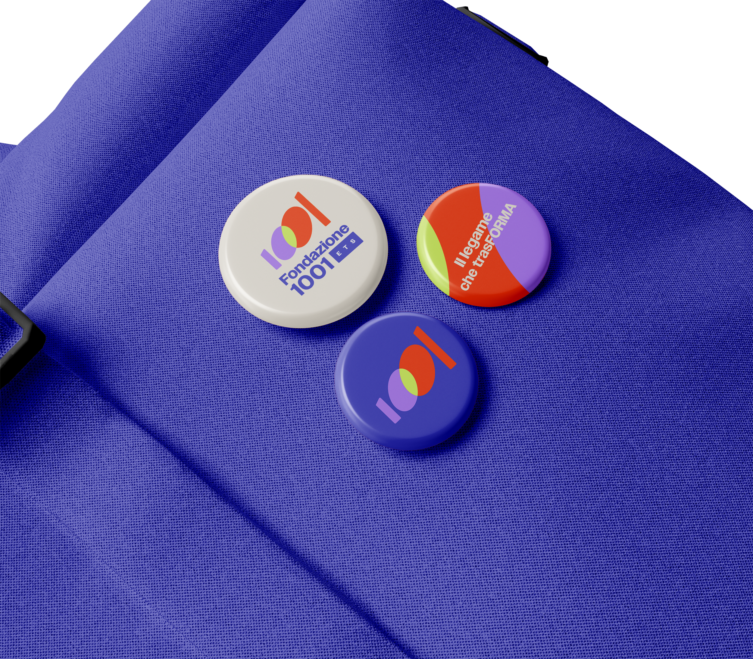
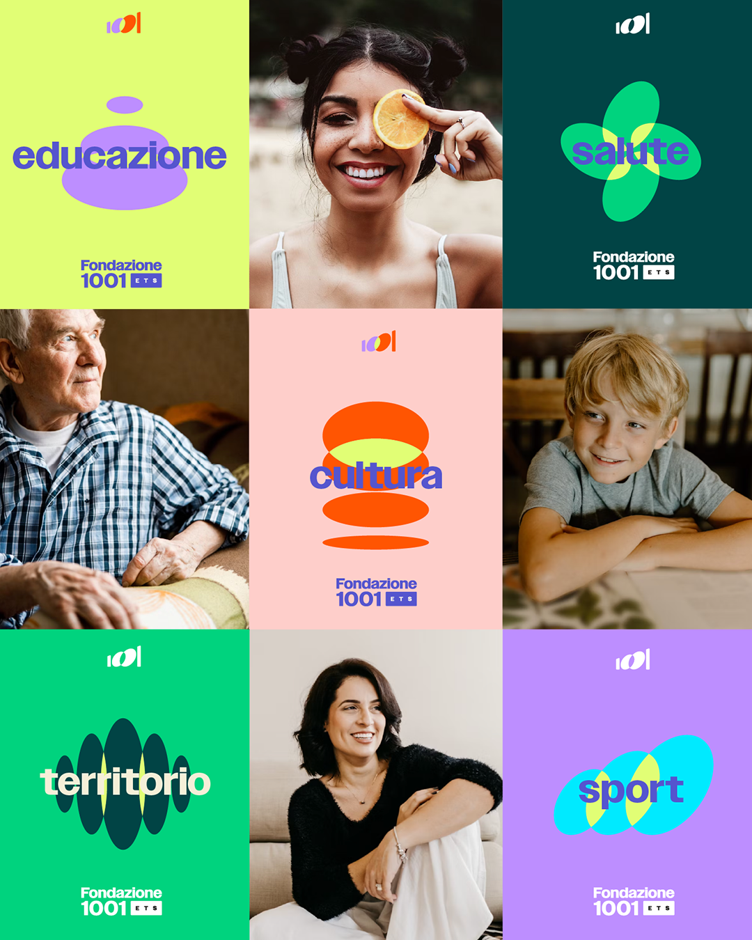
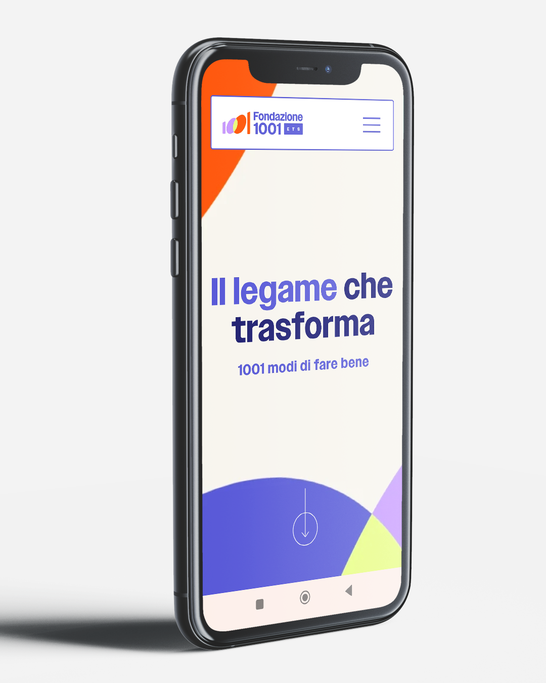
The project began with the creation of a new mark, designed to be recognisable and, quite literally, leave a mark. I worked on a new logo and the elements of the brand identity to build a solid identity: a coherent, recognisable visual system capable of working across every level of communication.
Only after defining this structure did the direction emerge, guided by the creative concept. After exploring several creative routes, the chosen one was:
The connection that transforms.
Not simply a message. A principle. One that emphasises how a territorial connection does more than unite: it generates value, activates relationships and sets people and ideas in motion. This is where identity gains meaning and becomes something that does not merely represent, but starts to work.
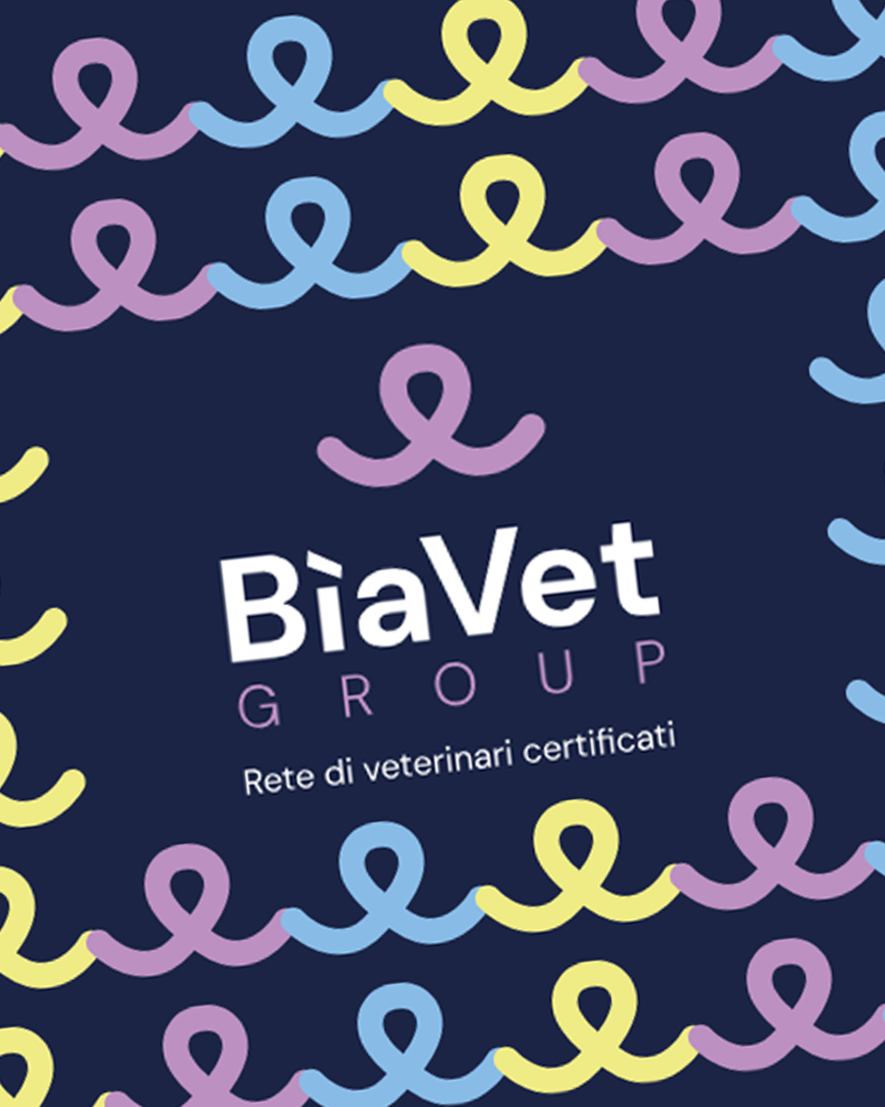
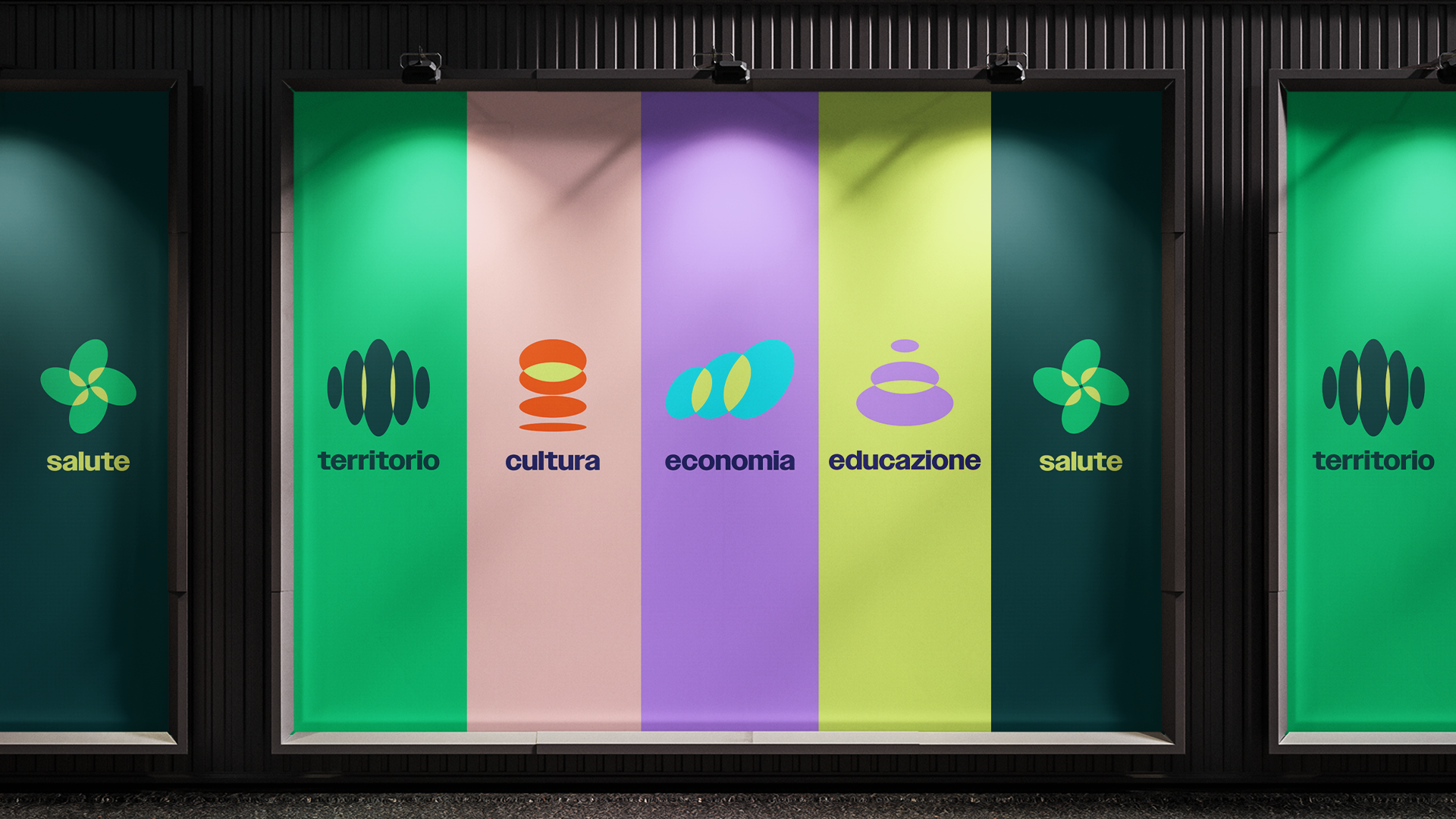
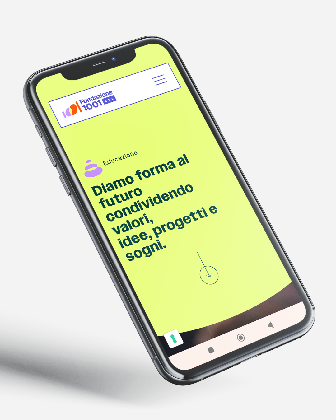
A vision alone is not enough. It needs a communication system capable of supporting it and making it tangible. That is why the work developed across several levels, building communication that is coherent, lively and never static. I developed several creative directions capable of bringing colour and rhythm to the Foundation, reflecting the vitality of the territory and of the people and companies involved.
A flexible visual language, designed to adapt to different contexts without losing recognisability.
The Brand Identity project includes:
design of the logo and its variations
definition of the visual language and payoffs
development of colour palettes and iconography
corporate identity system
digital presentation
ADV and institutional communication applications
social and digital adaptations
website
The aim is to communicate a Foundation that is dynamic, close to people and capable of giving substance to the projects it supports. Not a rigid identity, but a system that lives.
This was a project built on listening and trust.
Telling the story of a community means entering real dynamics without oversimplifying them. I worked together with the Fondazione 1001 team to find a balance between vision and practicality, between identity and openness.
A continuous exchange of ideas, checks and adjustments. Because when a project involves many people, it cannot be imposed: it has to be shared.
Working with the Foundation taught me a great deal, above all the consistency and commitment required to believe that shared ideas can become real, valuable projects, and that there is still a desire to work together for the development of a community. Even when it takes effort, even when it is complicated, because you eventually discover that the outcome makes the effort worthwhile.
 Subscribe to the newsletterA dose of yellow, every now and thenSubscribe to the newsletterA dose of yellow, every now and thenSubscribe to the newsletterA dose of yellow, every now and thenSubscribe to the newsletterA dose of yellow, every now and thenSubscribe to the newsletterA dose of yellow, every now and thenSubscribe to the newsletterA dose of yellow, every now and thenSubscribe to the newsletterA dose of yellow, every now and thenSubscribe to the newsletterA dose of yellow, every now and thenSubscribe to the newsletterA dose of yellow, every now and thenSubscribe to the newsletterA dose of yellow, every now and thenSubscribe to the newsletterA dose of yellow, every now and thenSubscribe to the newsletterA dose of yellow, every now and then