Designing a website does not simply mean building pages.
It means creating an experience capable of guiding people through content, technology and brand identity.
For Luxoro, a leading name in hot- and cold-stamping embellishments and application technologies, the project came from a precise need: transforming technical, complex content into a platform that is accessible, functional and elegant.
A project where strategy, structure and visual language become part of the same system.
Before design even began, the project required in-depth work on website architecture to create a structure capable of enhancing the brand’s core business - transfer materials, technologies and applications - through intuitive, easy-to-navigate pathways.
Defining the website structure from the outset meant organising technical content, case studies and application solutions coherently, improving the fluidity of navigation and the user experience.
Because an effective website does not simply look good. It helps target audiences orient themselves and find the information they need.
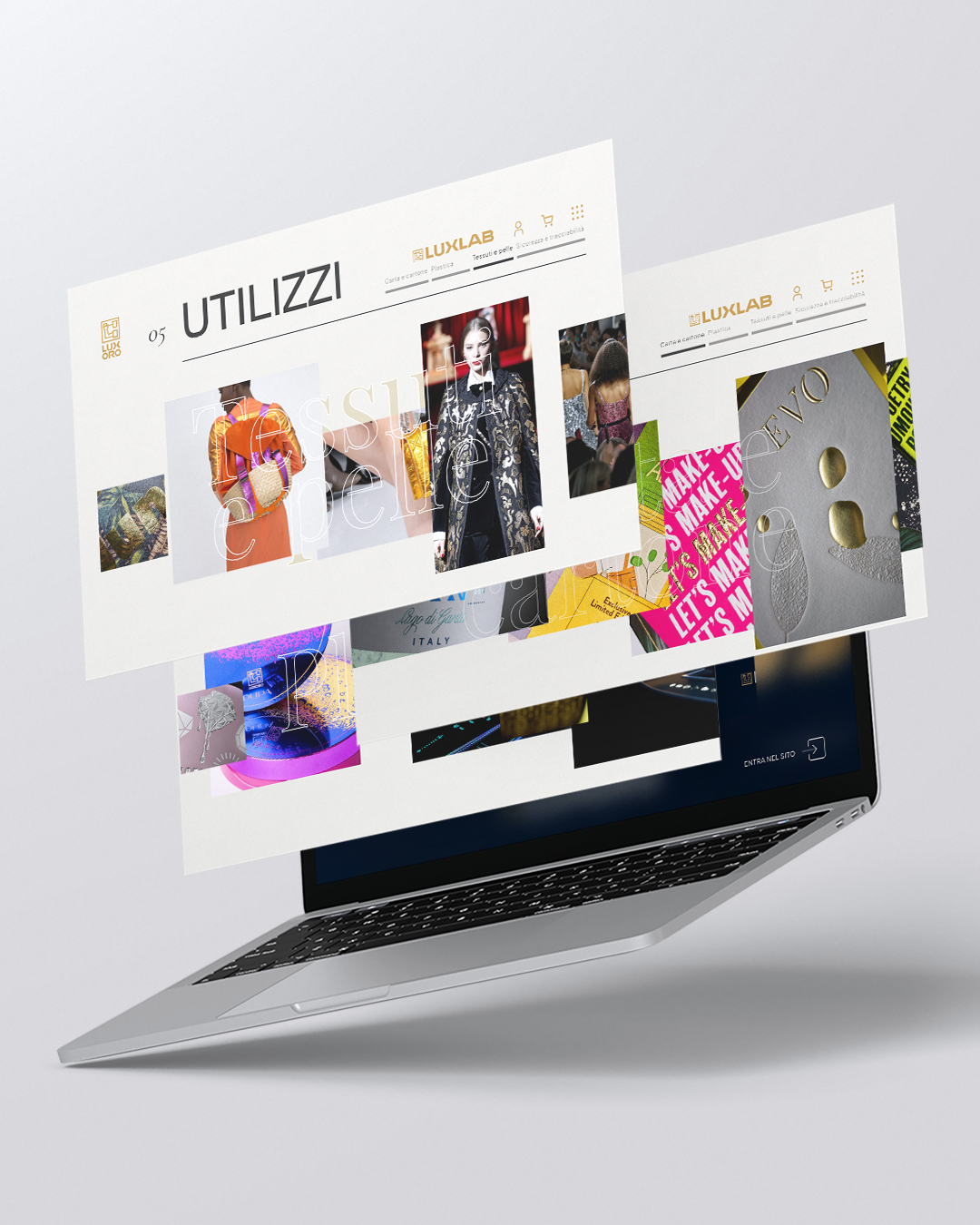
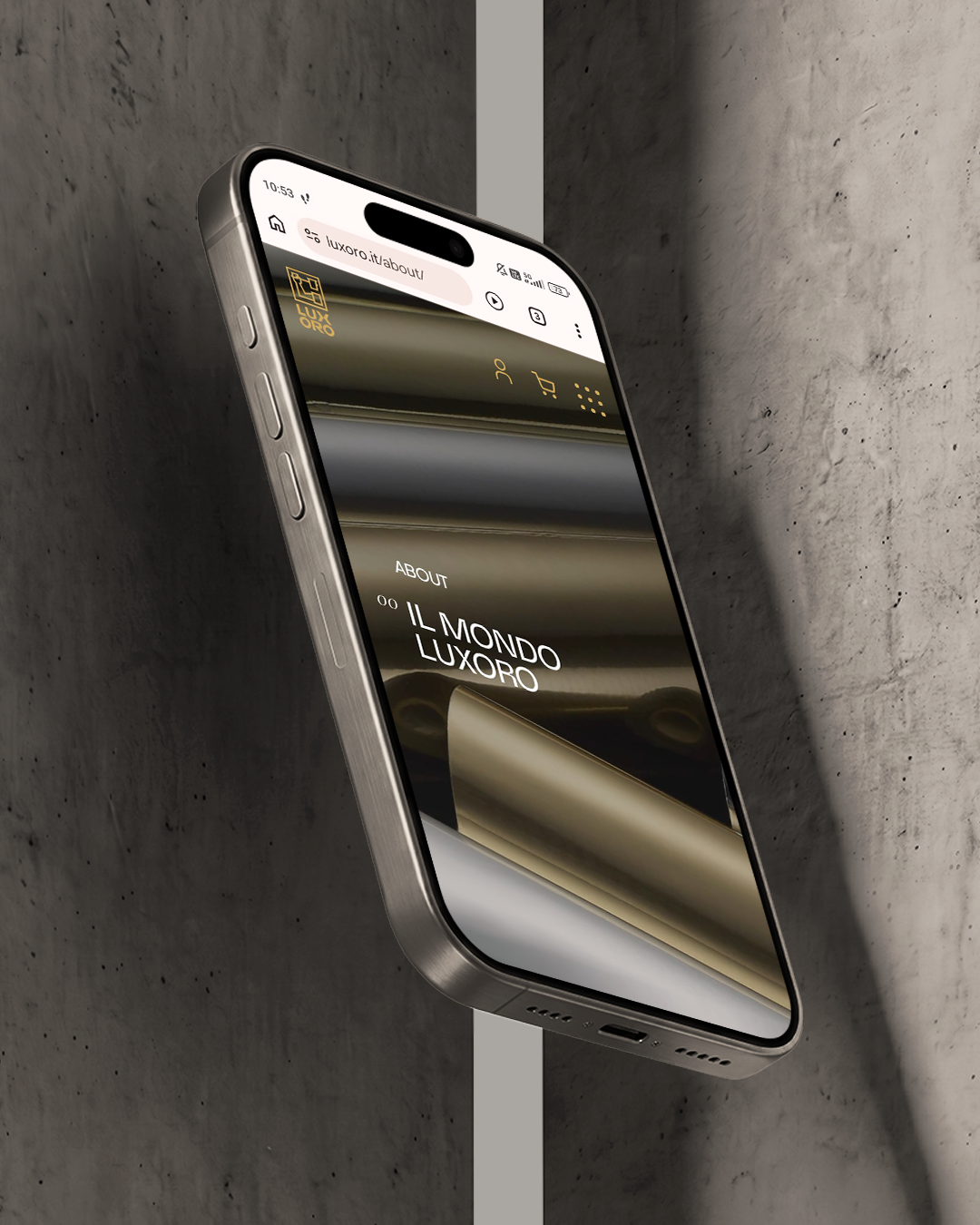
Once the structure was defined, the work focused on web design and layout development. The homepage was designed to make the key information immediately understandable, guiding the user into the Luxoro world before they even explore the navigation in detail.
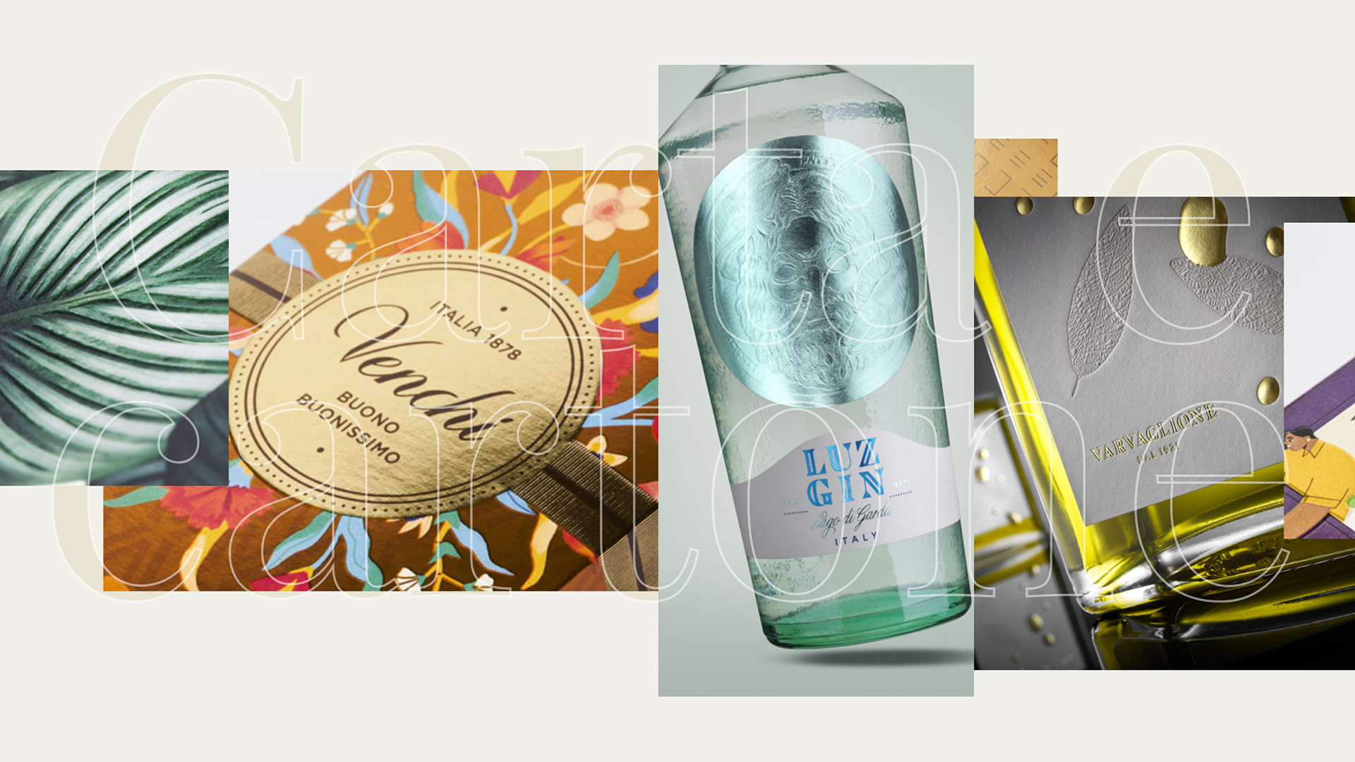
Images were given a central role in the brand communication. Photography, tactile details and real applications help users understand the quality, finish and potential of Luxoro technologies, transforming the website into a narrative space as well as an information platform.
The same logic was applied to the case-study section, developed through dynamic grids of images and videos designed to showcase materials, processes and final results.
The project involved:
website architecture
UX and content organisation
layout and visual hierarchy design
creative direction and web design
photography and video enhancement
case-study section design
responsive development
typographic research and visual consistency
Even the choice of typeface becomes part of the story.
Given Luxoro’s strong connection with the world of print, a typeface from the INK category was selected, capable of evoking precision, tactility and graphic culture.
Working with Luxoro is always a great pleasure for me, thanks to the mutual respect we share. The continuous exchange with their highly technical world, rich in details, materials and application possibilities, is always a source of inspiration and new knowledge.
Only by listening and trying to genuinely understand their objectives were we able to create such a complex project together.
The most interesting challenge was finding the right balance between technical precision and communication clarity, creating a digital experience capable of enhancing the brand identity without weighing down the navigation.
 Subscribe to the newsletterA dose of yellow, every now and thenSubscribe to the newsletterA dose of yellow, every now and thenSubscribe to the newsletterA dose of yellow, every now and thenSubscribe to the newsletterA dose of yellow, every now and thenSubscribe to the newsletterA dose of yellow, every now and thenSubscribe to the newsletterA dose of yellow, every now and thenSubscribe to the newsletterA dose of yellow, every now and thenSubscribe to the newsletterA dose of yellow, every now and thenSubscribe to the newsletterA dose of yellow, every now and thenSubscribe to the newsletterA dose of yellow, every now and thenSubscribe to the newsletterA dose of yellow, every now and thenSubscribe to the newsletterA dose of yellow, every now and then