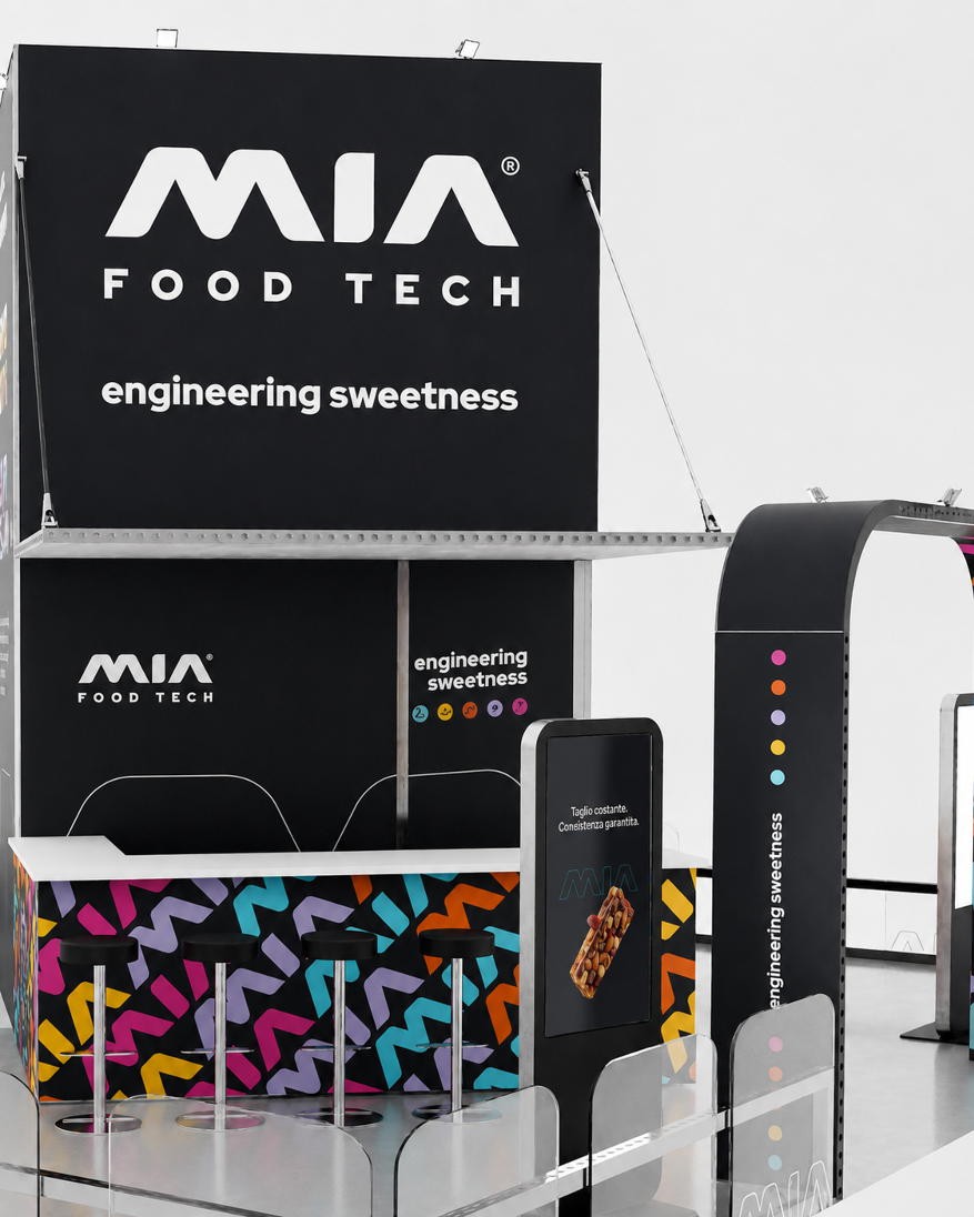
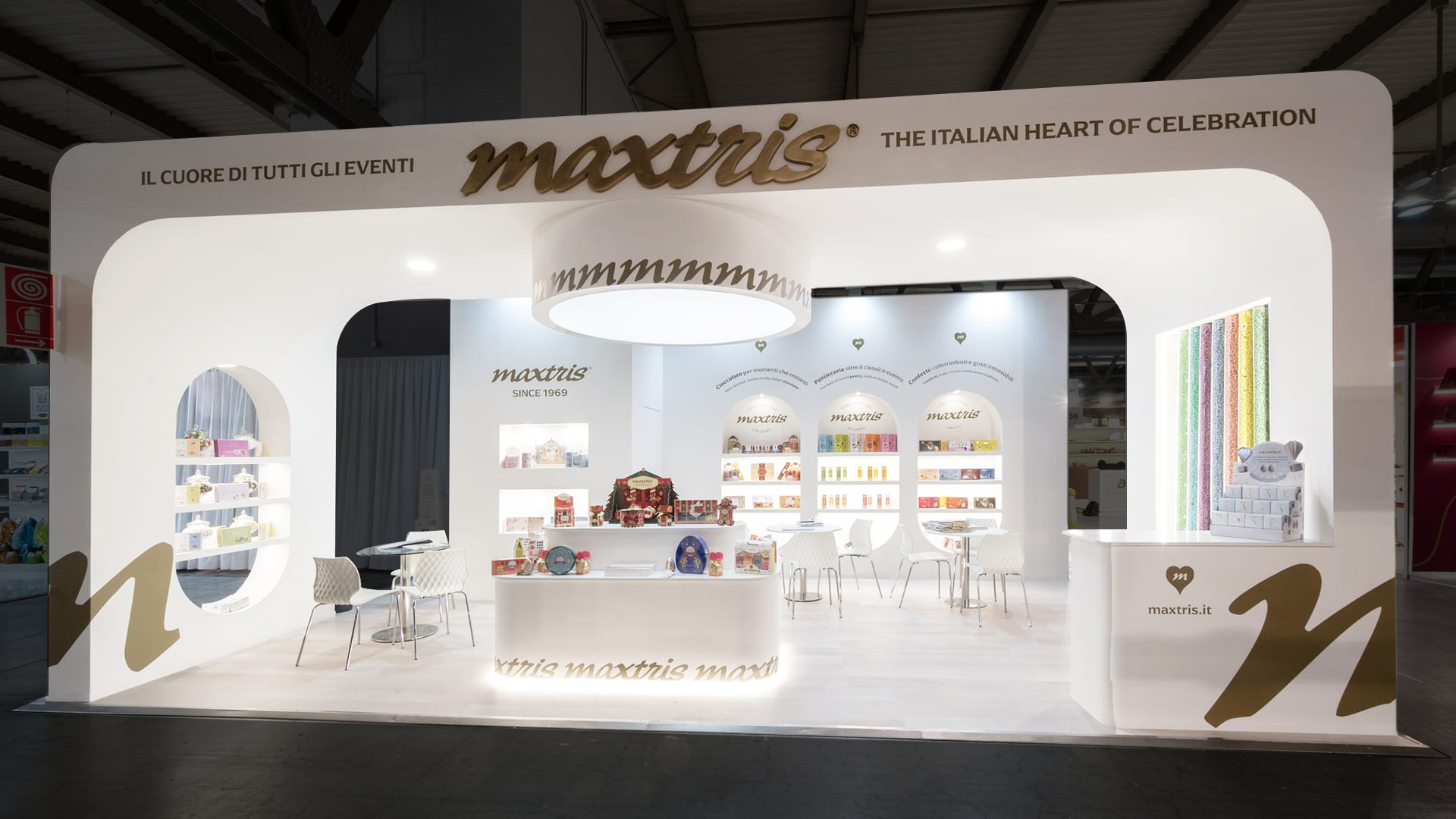
A stand is not simply an exhibition space: it is a strategic positioning tool, capable of communicating an identity and transforming it into an experience. The trade fair stand project for Maxtris was created in collaboration with DNA Stands: a shared process that brought creative vision and technical expertise together to turn the concept into a tangible, functional and immersive space. On one side, the development of the stand’s style and visual identity; on the other, the creation of design solutions capable of shaping an experiential and fully functional environment.
A stand designed to welcome, communicate and enhance the Maxtris world through architecture, branding and visual experience.
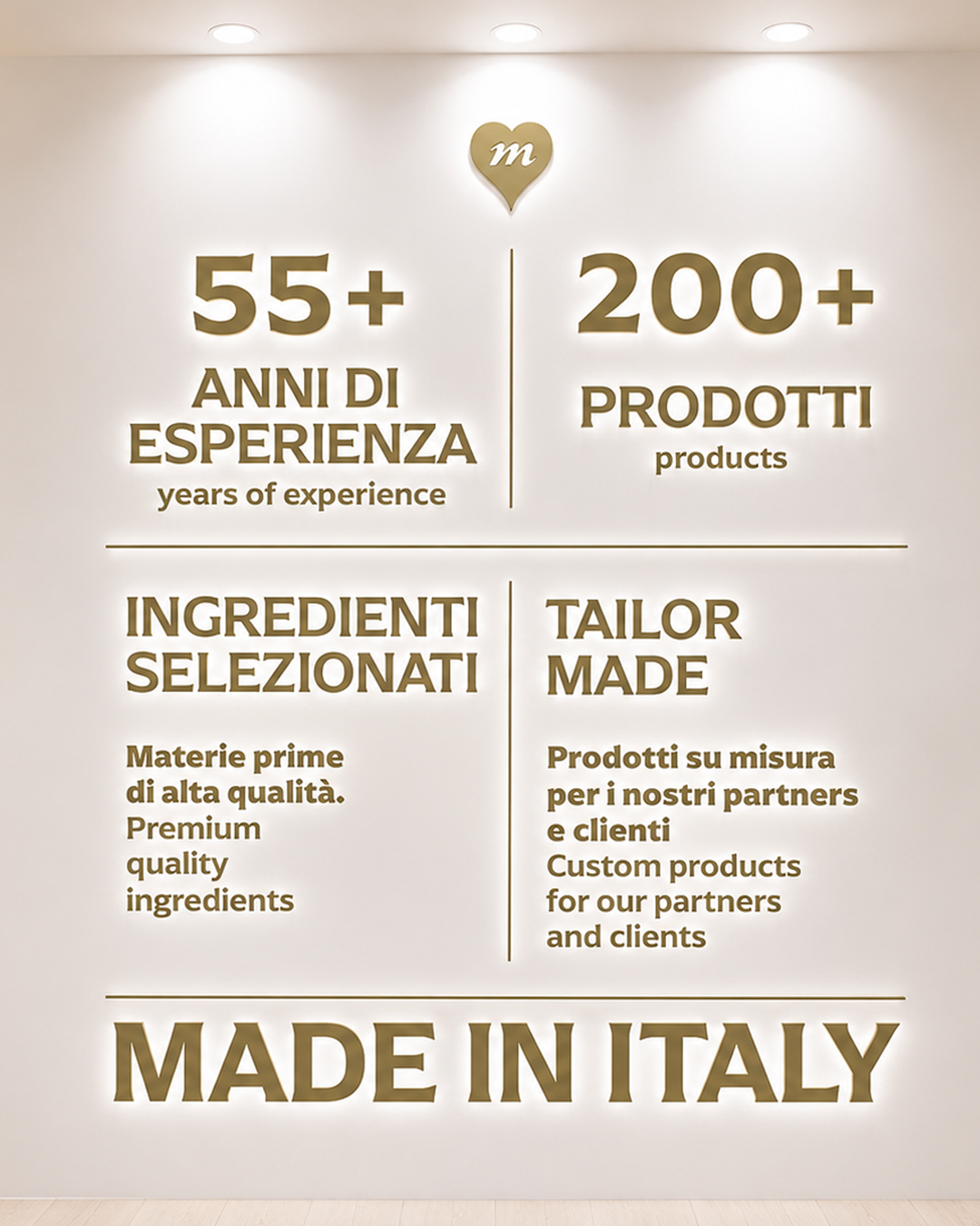
The objective was to create a trade fair space capable of representing the full evolution of the Maxtris brand, maintaining a balance between Italian heritage, contemporaneity and visual impact.
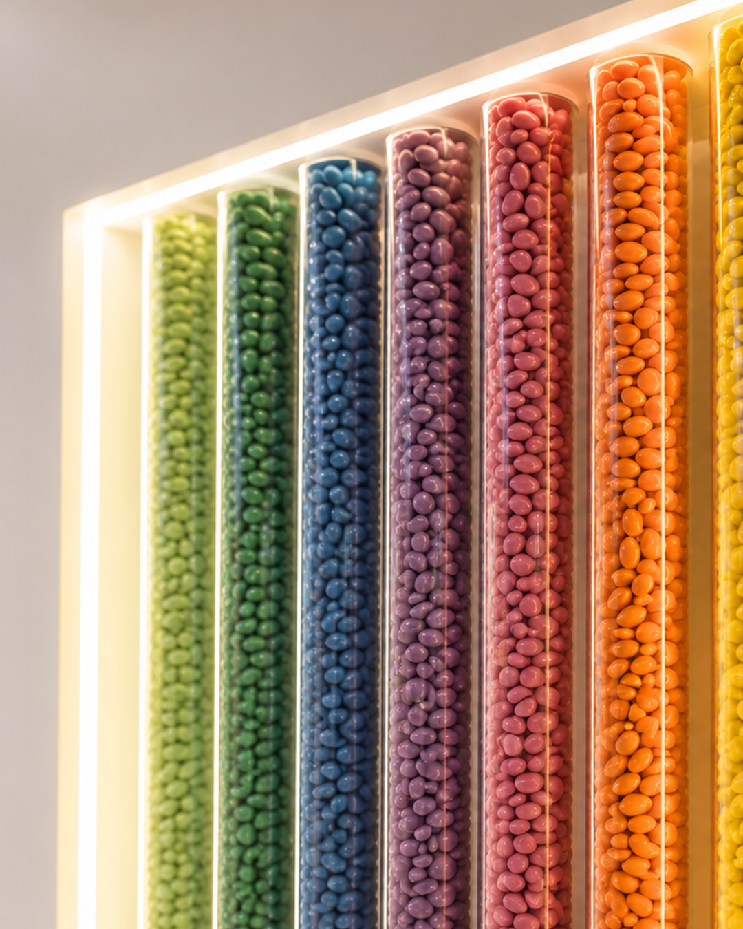
The stand was conceived as an open, welcoming environment, designed to leave room for the true protagonist: the product. A neutral and elegant space was chosen precisely to showcase Maxtris’s ultra-colourful packaging at its best, making it the visual focus of the installation. Around the products, the environment tells the story of the brand through materials, details and a visual language consistent with the world of celebration.
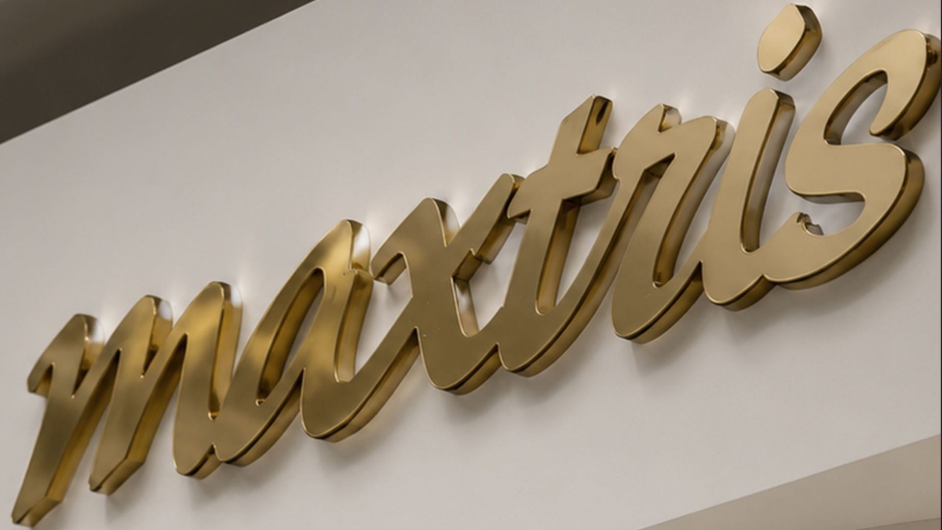
The project takes shape through an essential yet scenographic architecture made of soft arches, clean volumes and a light palette enriched by gold details. Light becomes a central element of the space: it illuminates the products, guides the eye and helps create an elegant, immersive atmosphere.
Display niches highlight the different Maxtris categories - chocolate, pastry and sugared almonds - building an orderly yet dynamic brand narrative. The graphic language follows the same direction: institutional claims, typographic details and emotional messages support the experience without weighing down the space.
The architectural neutrality of the stand allows the colours of the products and packaging to emerge even more strongly, creating contrast, visual order and immediate recognition.
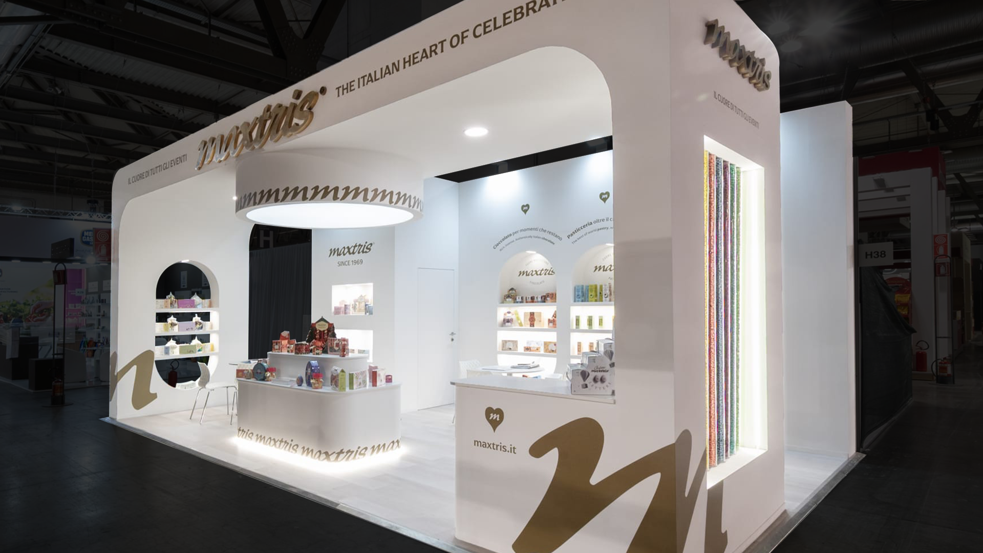
The Maxtris stand project comes from the desire to translate the brand identity into a coherent and recognisable space.
Its elegant, contemporary and deeply Italian identity was translated into the trade fair environment through architecture, materials, light and visual design, creating a space consistent with the brand positioning.
The project involved:
stand design
lighting and visual experience study
integration of the brand language
product display area design
development of institutional claims and messaging
visual merchandising coordination
rendering and 3D simulations
project coordination with DNA Stands
Working with Maxtris means working with a brand built on emotion, ritual and details. The most interesting part of the project was turning these values into architecture and physical perception, creating a space capable of communicating elegance without feeling distant, and contemporaneity without losing warmth.
Every choice - from lighting to materials, from volumes to product placement - was designed to reinforce the sense of welcome and celebration that the brand carries with it.
 Subscribe to the newsletterA dose of yellow, every now and thenSubscribe to the newsletterA dose of yellow, every now and thenSubscribe to the newsletterA dose of yellow, every now and thenSubscribe to the newsletterA dose of yellow, every now and thenSubscribe to the newsletterA dose of yellow, every now and thenSubscribe to the newsletterA dose of yellow, every now and thenSubscribe to the newsletterA dose of yellow, every now and thenSubscribe to the newsletterA dose of yellow, every now and thenSubscribe to the newsletterA dose of yellow, every now and thenSubscribe to the newsletterA dose of yellow, every now and thenSubscribe to the newsletterA dose of yellow, every now and thenSubscribe to the newsletterA dose of yellow, every now and then