In the trade fair world, a stand is not only there to be seen.
It has to communicate an identity in just a few seconds, within a shared environment where every brand is competing for attention.
For MIA Food Tech, the project developed for SIGEP 2026 came from exactly this need: to create a space capable of communicating innovation, technology and personality through architecture, graphics and visual language, in line with the new brand identity.
A stand designed to turn passing by into an experience and make the MIA Food Tech brand instantly recognisable.

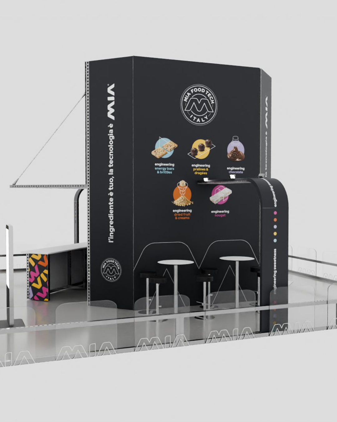
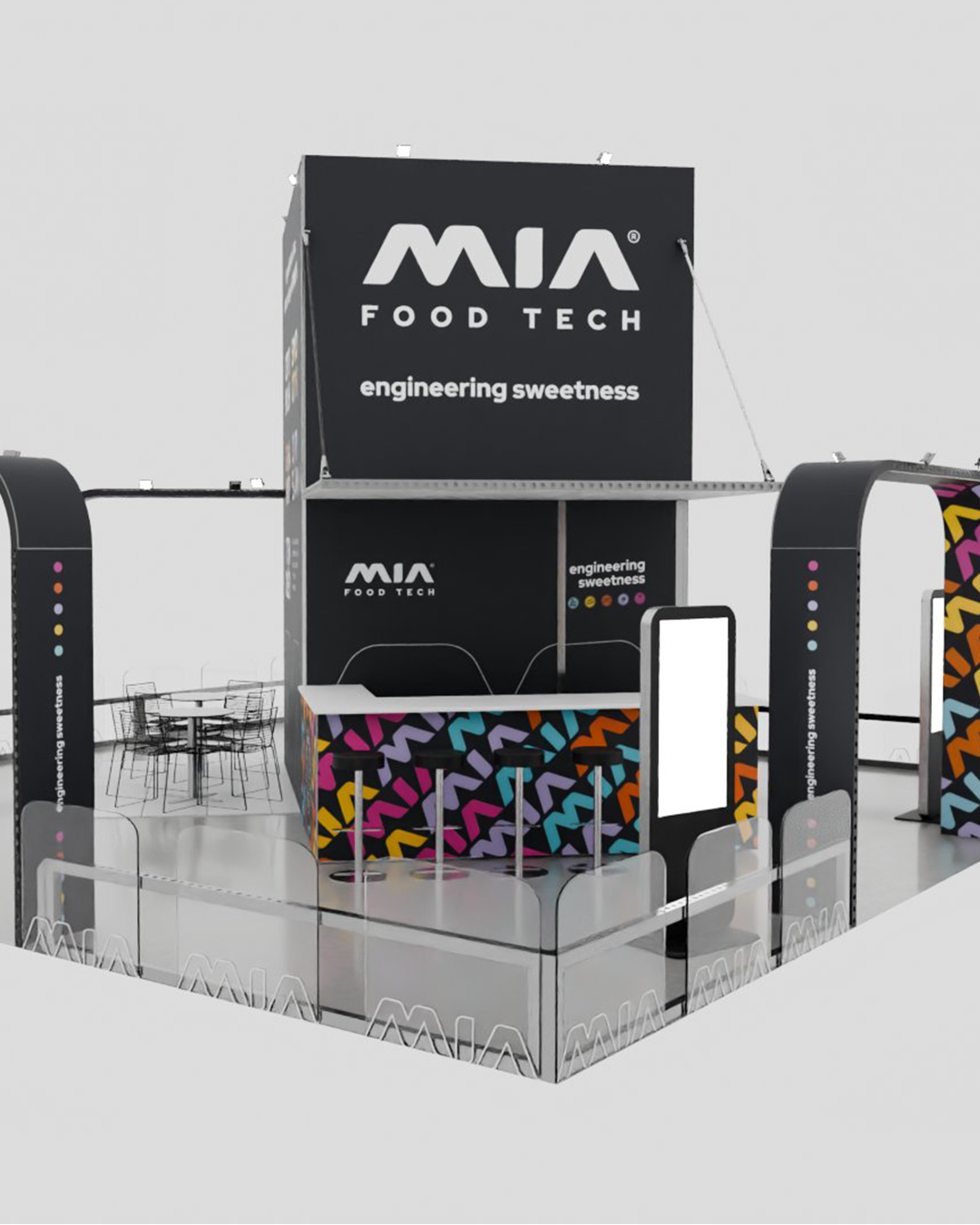
The objective was to create a trade fair stand capable of standing out in a highly competitive context such as SIGEP, differentiating MIA through image from its competitors.
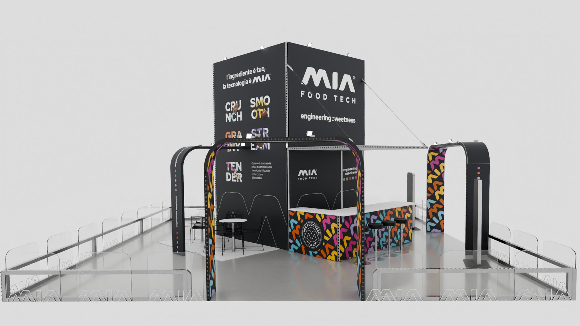
The space needed to enhance MIA Food Tech’s innovative positioning through a pop, unconventional language for the sector. The brief was to communicate technology and engineering in an accessible way, creating strong visual impact even from a distance. The technical design was developed to create an open, recognisable and dynamic environment where cutting-edge machinery could be displayed against a visually powerful backdrop.
The design approach sought to integrate branding, hospitality and commercial interaction, because even in the industrial sector visual perception is part of the brand experience.
The project revolves around a highly impactful central vertical structure, designed to increase stand visibility and strengthen the brand’s presence within the exhibition space.
Around this element, an essential yet highly recognisable architectural system takes shape, characterised by:
structural arches with strong graphic personality
high-contrast black surfaces
vibrant colour patterns
integration of technical communication and contemporary visual language
The visual component therefore becomes an integral part of the experience.
Colour breaks the rigidity of the engineering world and transforms the stand into an open, dynamic and memorable space.
Everything follows the brand payoff, “Engineering Sweetness”, which works in exactly this direction, seeking a balance between technical precision and a more human approach to confectionery production.
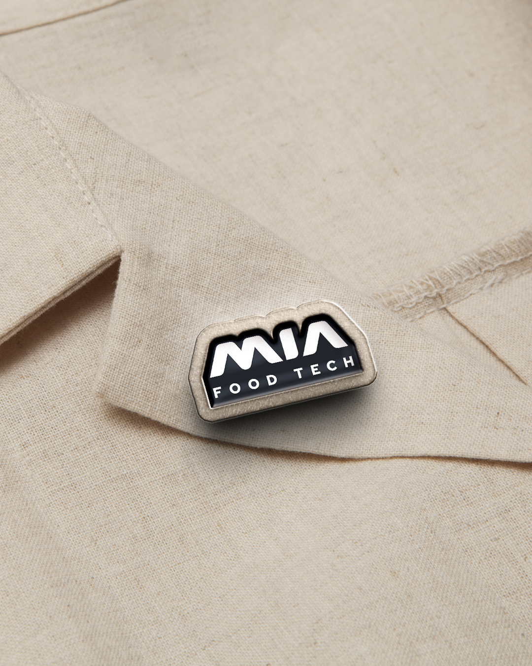
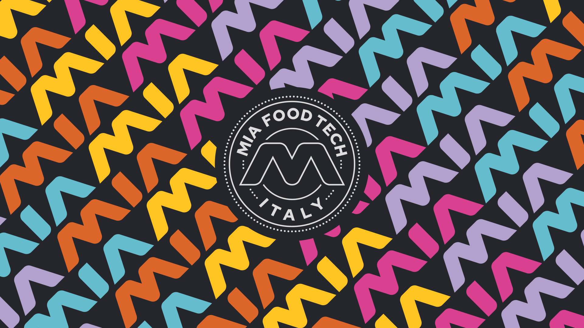
Before the stand itself, the work began with the creation of MIA Food Tech’s visual identity. A graphic language designed to make the brand more contemporary, distinctive and recognisable, even within highly competitive trade fair environments.
The SIGEP 2026 stand therefore becomes the physical extension of this identity: colours, patterns, architecture and surfaces transform branding into a real experience, creating continuity between communication, space and brand perception.
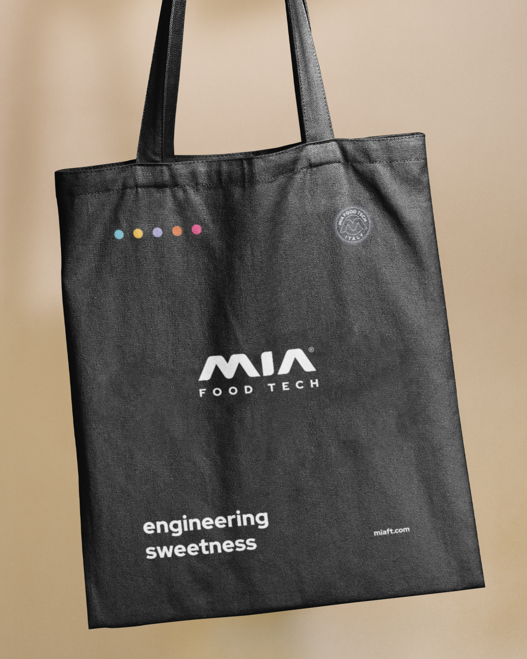
Coordinated merchandising was also designed to reinforce recognition and help build a coherent, memorable visual ecosystem.
The project involved:
architectural design of the stand
rendering and 3D simulations
study of circulation routes and openings
environmental branding
graphic development of surfaces
design of hospitality and meeting areas
integration of the MIA Food Tech visual language
lighting and trade fair visibility study
design and production of merchandising
Every element was conceived to make the stand recognisable from different viewpoints and to facilitate interaction, meetings and time spent within the space.
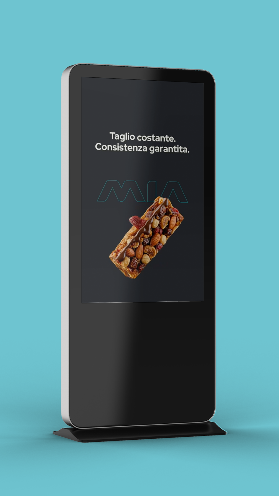
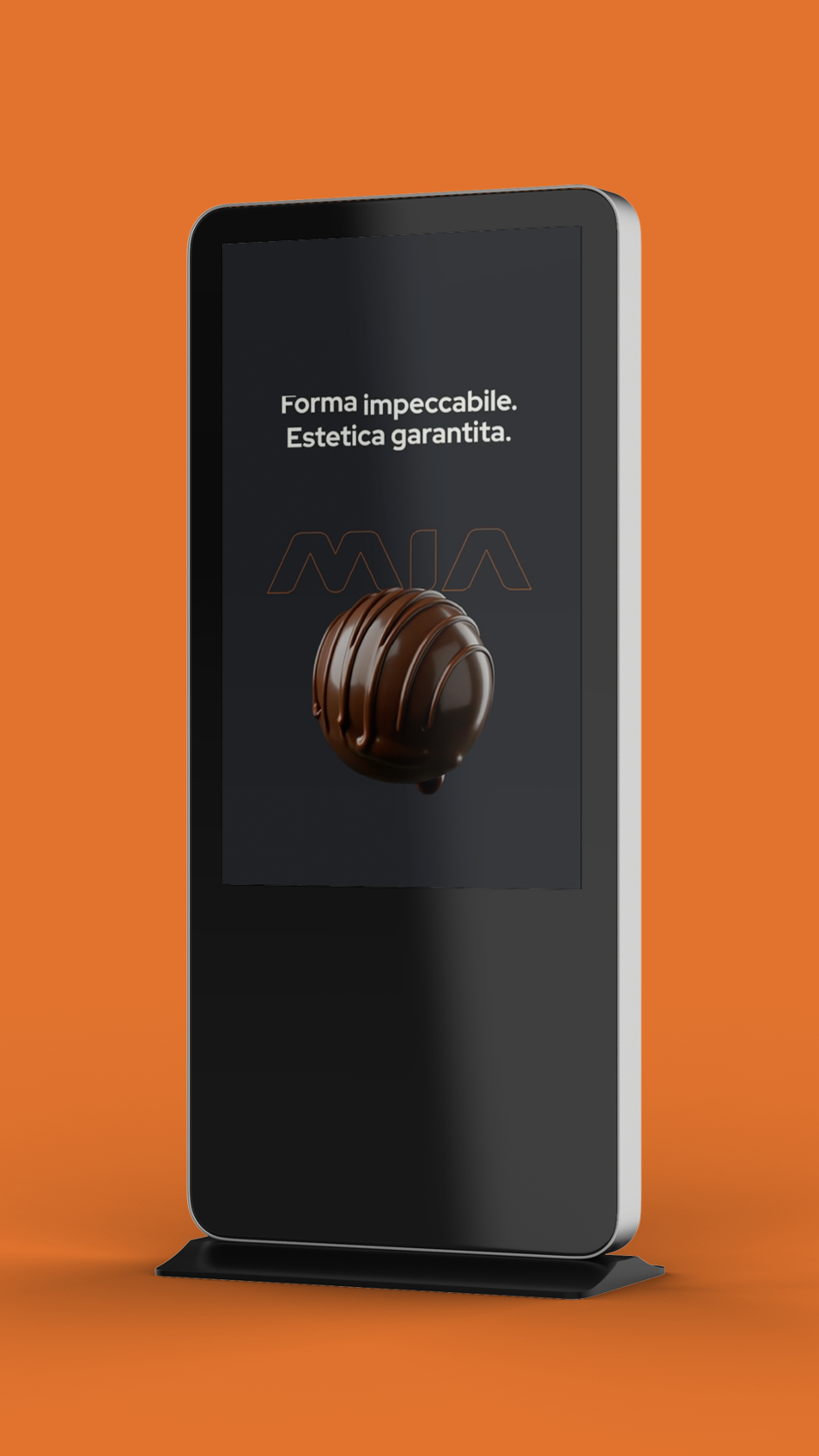
Working with MIA Food Tech allowed me to design a space capable of representing a technical company without falling into the usual visual language of the sector. A brief that immediately excited me precisely because it went beyond the usual conventions.
The most interesting challenge was maintaining solidity and authority while leaving room for colour, identity and character, exactly as the company wanted. Because engineering can also communicate energy, openness and contemporaneity.
And when architecture and brand start working together, a stand stops being simply an exhibition space. It becomes something people remember after the fair is over.
 Subscribe to the newsletterA dose of yellow, every now and thenSubscribe to the newsletterA dose of yellow, every now and thenSubscribe to the newsletterA dose of yellow, every now and thenSubscribe to the newsletterA dose of yellow, every now and thenSubscribe to the newsletterA dose of yellow, every now and thenSubscribe to the newsletterA dose of yellow, every now and thenSubscribe to the newsletterA dose of yellow, every now and thenSubscribe to the newsletterA dose of yellow, every now and thenSubscribe to the newsletterA dose of yellow, every now and thenSubscribe to the newsletterA dose of yellow, every now and thenSubscribe to the newsletterA dose of yellow, every now and thenSubscribe to the newsletterA dose of yellow, every now and then