BOOOOM was born from a simple yet disruptive idea: turning a drink into something more than a beverage. A visual, sensory and immediate experience capable of combining the character of Italian sparkling wine with the freshness of fruit. An international project, born among the hills of the Langhe and developed to speak to a contemporary, dynamic and global audience.
Not simply a product to drink, but a brand built to communicate energy, colour and personality at first glance.
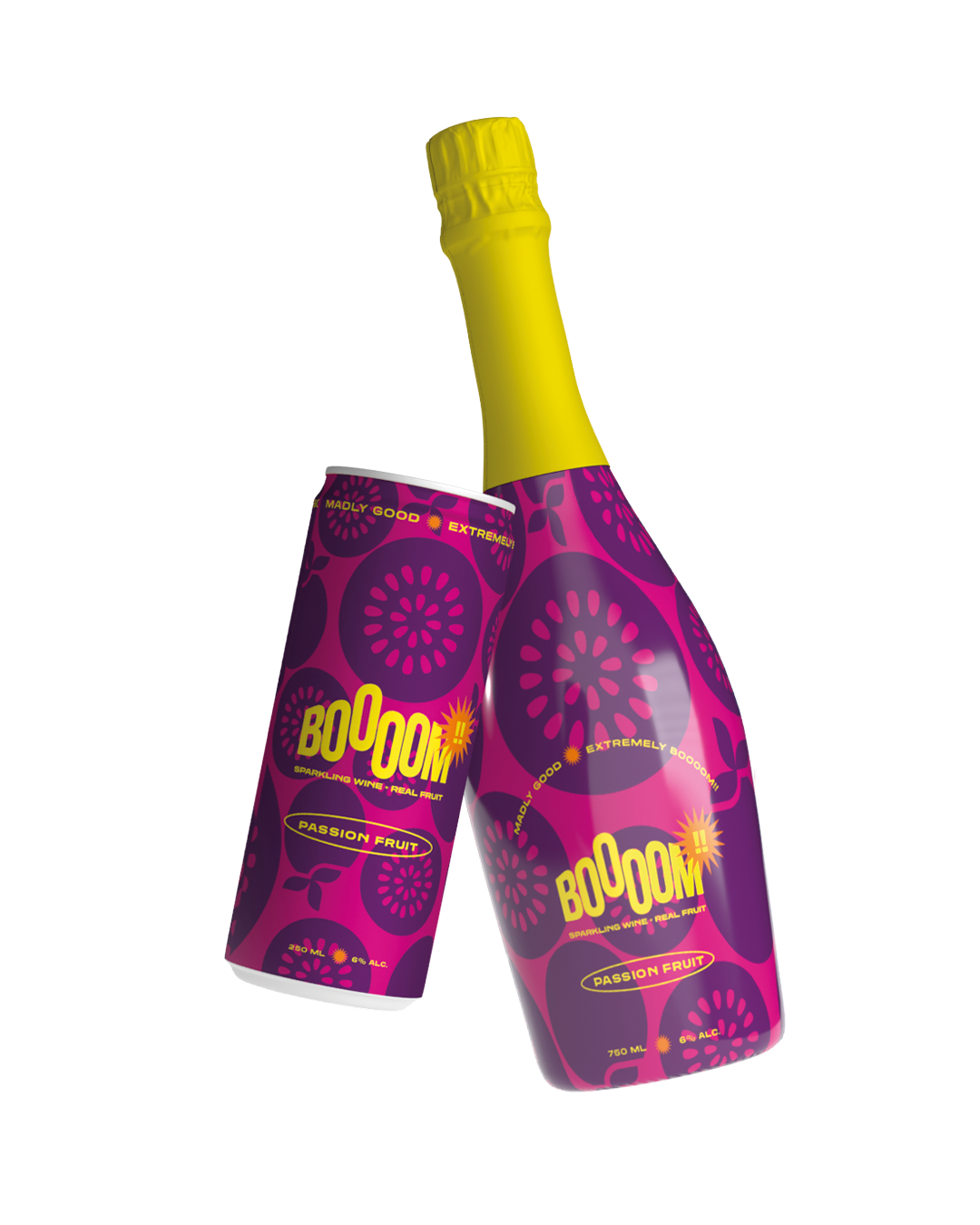
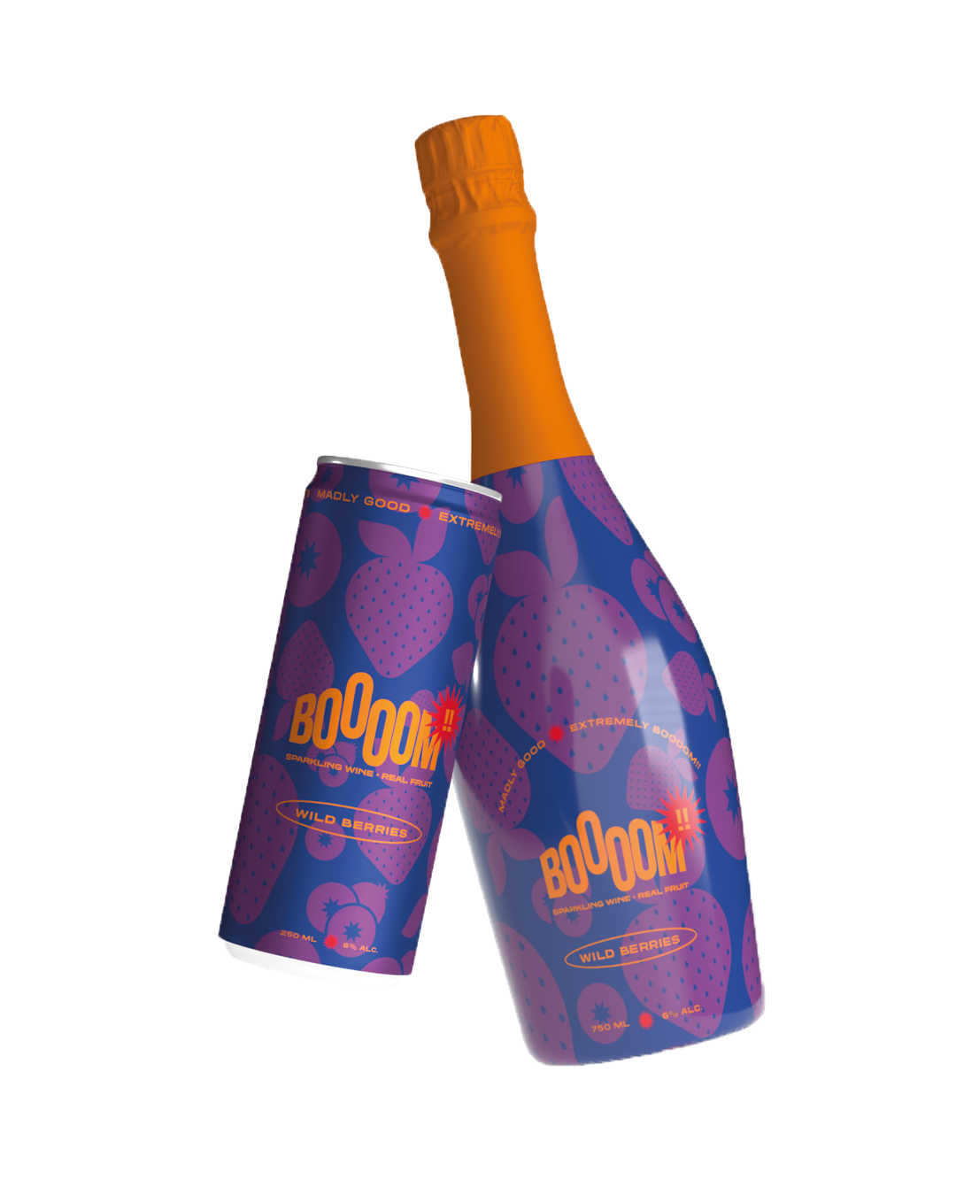
The objective was to create a strong, immediate and recognisable identity in an extremely competitive market such as ready-to-drink beverages. This identity then had to be applied across the soft-drink range, in both can and bottle formats.
The project needed to:
enhance the combination of Italian sparkling wine and fruit blends
build an international visual language
communicate energy and contemporaneity
make the product memorable on shelf and online
speak to a young, lifestyle-oriented audience Because this is a product that needs an imaginary capable of activating desire, sharing and experience.
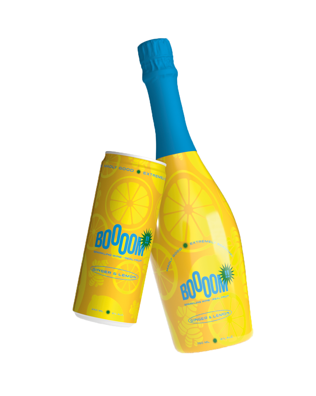
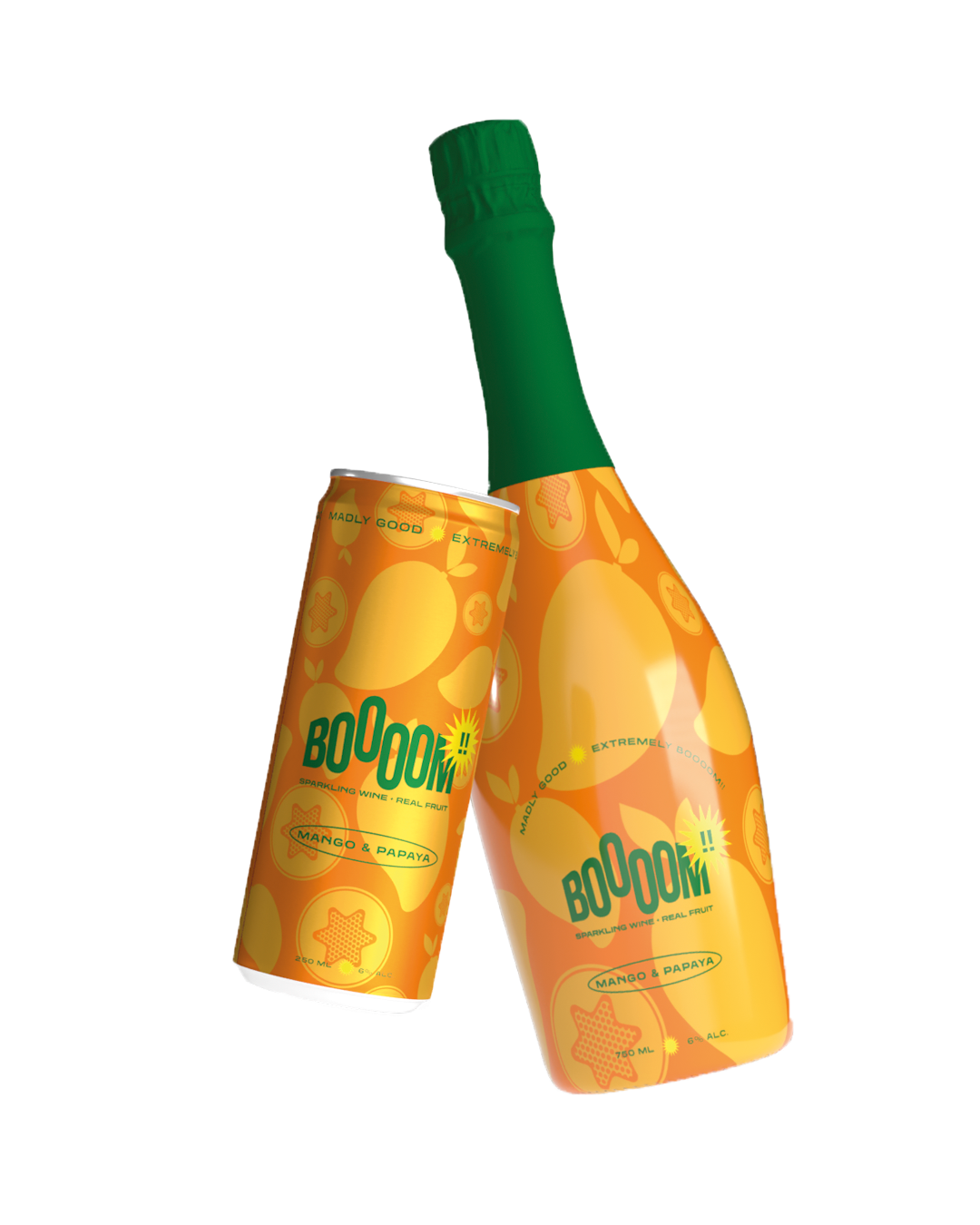
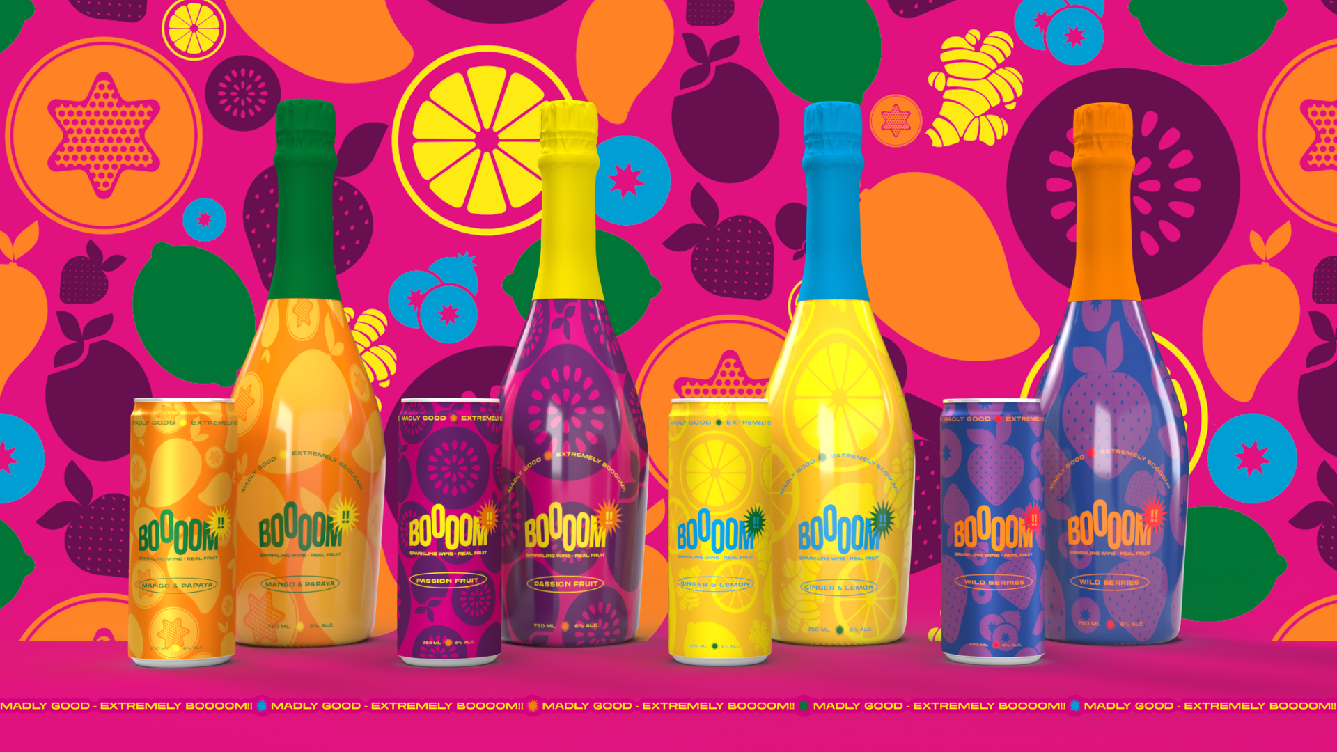
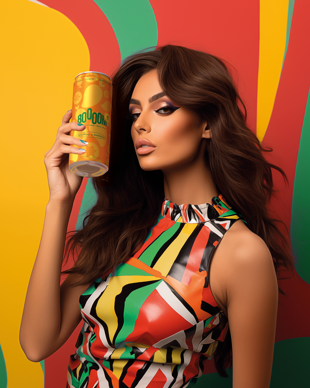
BOOOOM comes from the meeting between sparkling wine from the Langhe and fresh, exotic fruit juices. This is where the entire brand identity takes shape: vibrant colours, a direct name, energetic visuals and a tone of voice designed to communicate lightness, positivity and immediate impact.
Every flavour becomes its own visual and sensory universe: Mango & Papaya, Passion Fruit, Wild Berries, Ginger & Lemon.
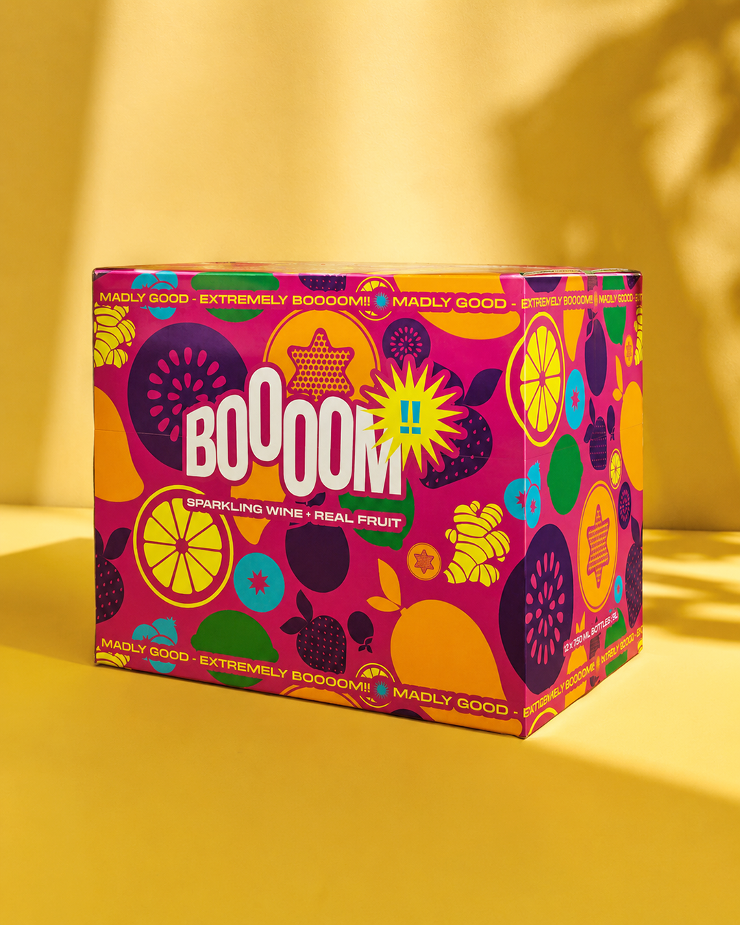
Packaging and graphic language work together to build a pop, fresh and recognisable experience, capable of turning every product into a small piece of entertainment.
Because BOOOOM does not simply want to look good. It wants to be irresistible!
The BOOOOM project started with naming research and then quickly developed into the creation of the entire packaging range. The objective was to build a strong, immediate and easily recognisable visual system, designed for large-scale distribution and capable of standing out clearly in the beverage market.
Each flavour was designed as a coherent extension of the brand, maintaining a shared identity while developing specific colours, details and personality for each reference. Everything was adapted for both cans and bottles through the use of full-body sleeves.
Pack design thus becomes the true heart of the project: not simply a container, but the first tool for attraction, recognition and product storytelling.
The work involved:
naming development
packaging range design
development of the coordinated graphic system
definition of colour palettes and visual codes
information hierarchy design
multi-format adaptation
visual product storytelling
ADV materials and digital content development
website and social content
Every element was designed to make BOOOOM immediately recognisable, memorable and ready to engage an international audience.
BOOOOM is one of those projects where creativity and vision move at the same speed. A brand built together, leaving room for experimentation, visual impact and the desire to move beyond the more traditional dynamics of the beverage industry.
The most interesting part was exactly this: turning a product into an attitude. Working with BOOOOM gave me that opportunity.
When identity, packaging and communication manage to speak the same language, a brand stops being simply something to consume. It starts becoming something to remember.
 Subscribe to the newsletterA dose of yellow, every now and thenSubscribe to the newsletterA dose of yellow, every now and thenSubscribe to the newsletterA dose of yellow, every now and thenSubscribe to the newsletterA dose of yellow, every now and thenSubscribe to the newsletterA dose of yellow, every now and thenSubscribe to the newsletterA dose of yellow, every now and thenSubscribe to the newsletterA dose of yellow, every now and thenSubscribe to the newsletterA dose of yellow, every now and thenSubscribe to the newsletterA dose of yellow, every now and thenSubscribe to the newsletterA dose of yellow, every now and thenSubscribe to the newsletterA dose of yellow, every now and thenSubscribe to the newsletterA dose of yellow, every now and then