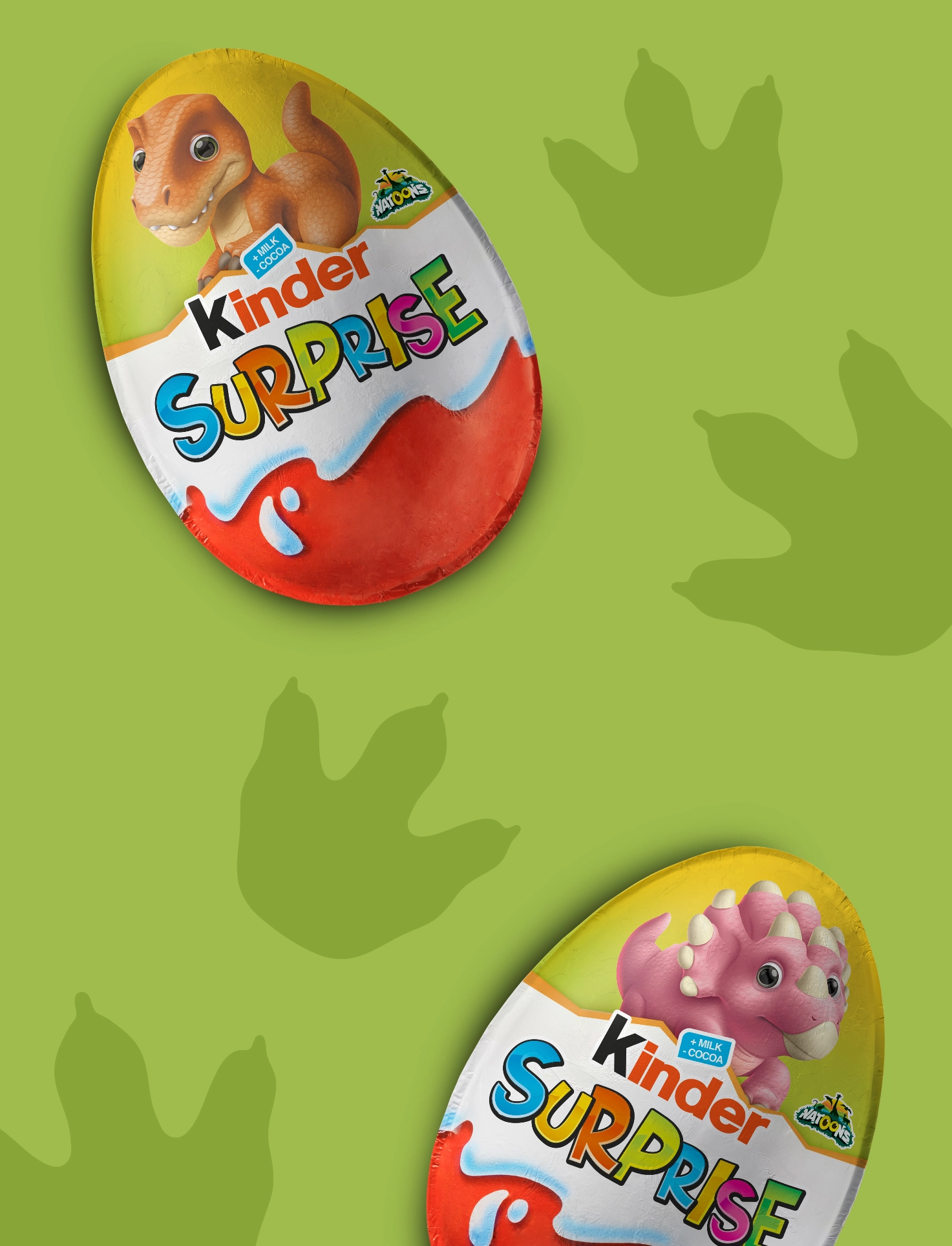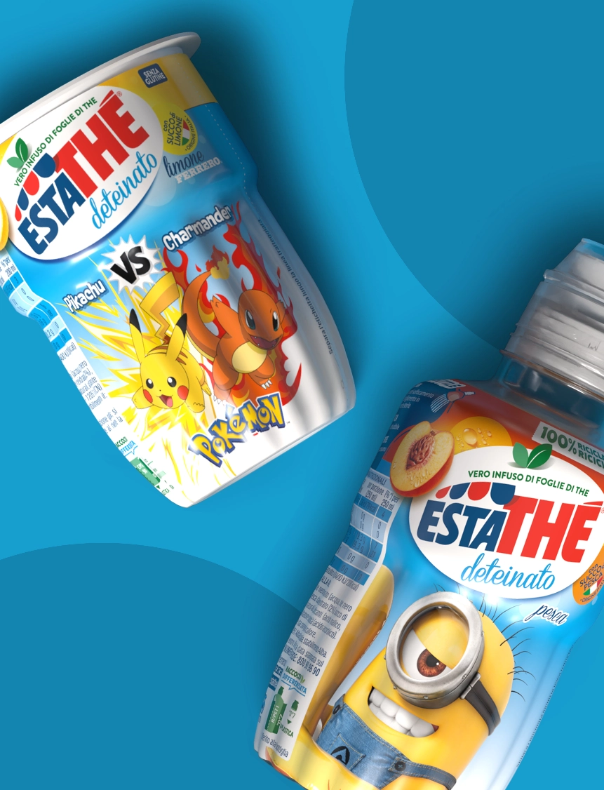
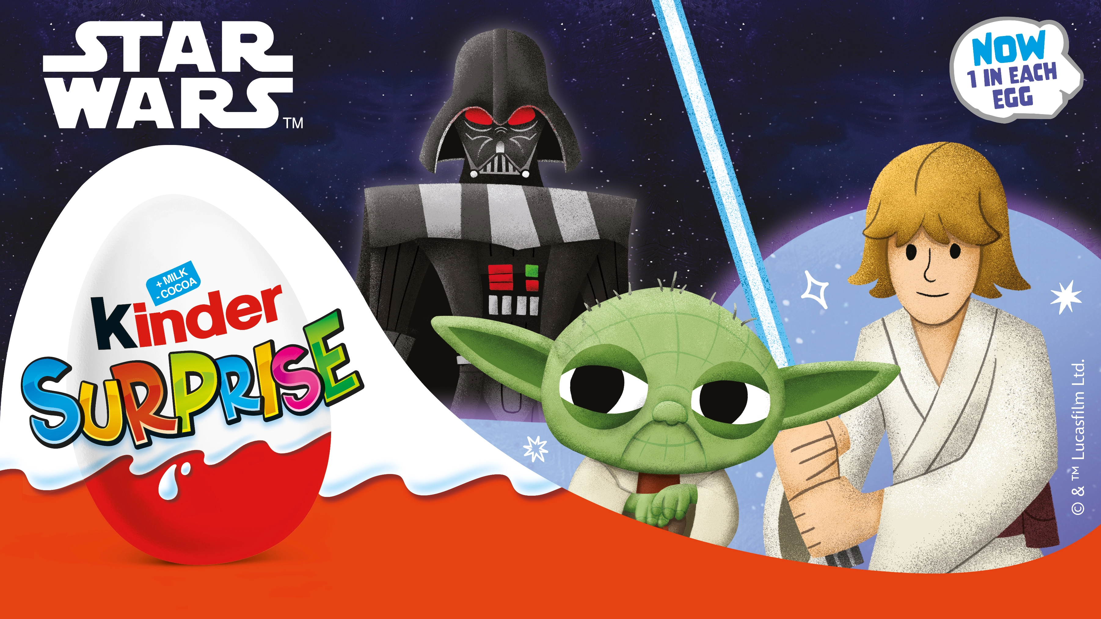
Some projects require design to do much more than dress a product. It has to find a balance between different worlds, preserve their identities and turn them into one coherent story.
The project developed for Kinder Ferrero came from this challenge: bringing Star Wars - one of the most iconic narrative universes in popular culture - into two symbolic products such as Kinder Surprise and Kinder Joy, without losing Kinder’s positioning, tone and recognisability.
A packaging design and graphic adaptation project conceived to make two very powerful imaginaries coexist within a single visual system.
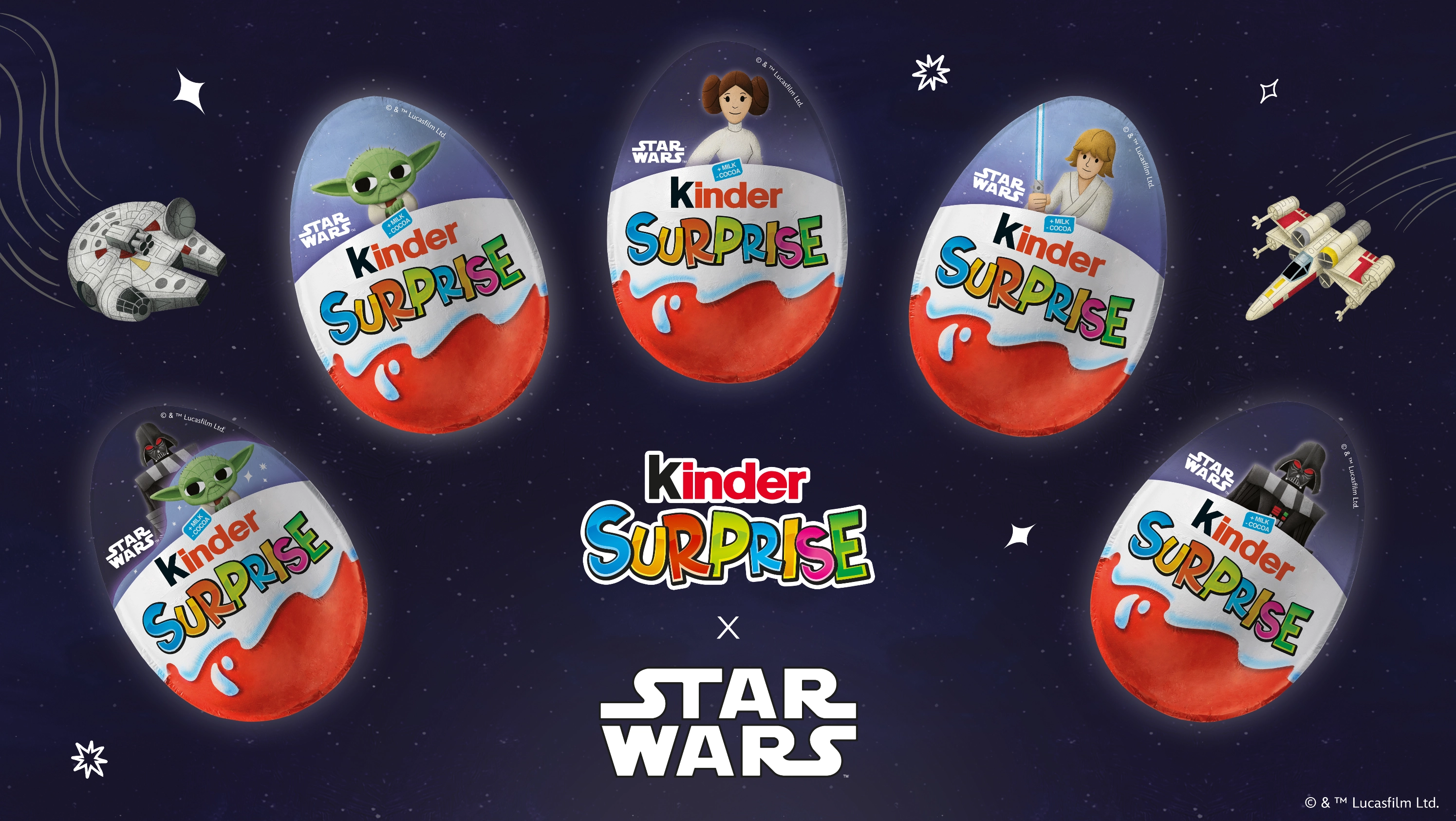
Integrating the Star Wars universe into the Kinder range meant working with a delicate balance: on one side, the evocative power of a global licence with an extremely codified visual imaginary; on the other, Kinder’s identity, with its distinctive language, positioning and immediate shelf recognition.
The objective was to develop a graphic system capable of enhancing Star Wars character appeal without distorting the Kinder world, while maintaining readability, consistency and brand continuity. Every element needed to respect this balance: not a simple application of the licence, but a genuine visual integration capable of speaking both to the Star Wars fan universe and to the Kinder consumer.
The heart of the project was the graphic adaptation of the Star Wars key visual across Kinder Surprise and Kinder Joy packaging, through careful design capable of integrating characters, atmospheres and the visual codes of the saga within the Kinder language.
It is a design exercise that requires precision and sensitivity: giving space to the narrative power of the licence without compromising product positioning, while maintaining clear visual hierarchy, shelf recognisability and continuity with the Kinder identity.
The packaging therefore becomes the meeting point between two universes: on one side, the iconic storytelling of Star Wars; on the other, Kinder’s accessible, distinctive and immediately recognisable language.
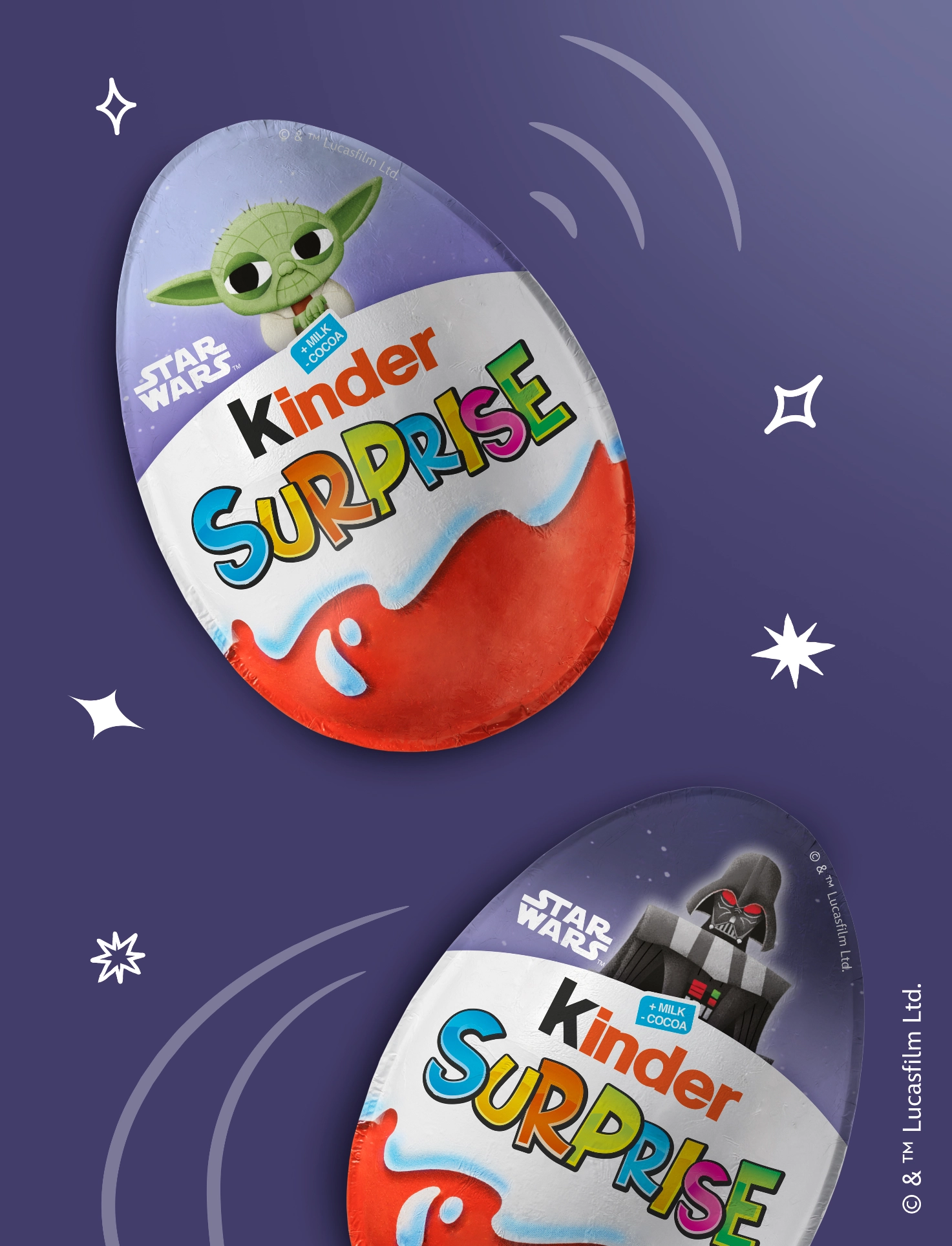
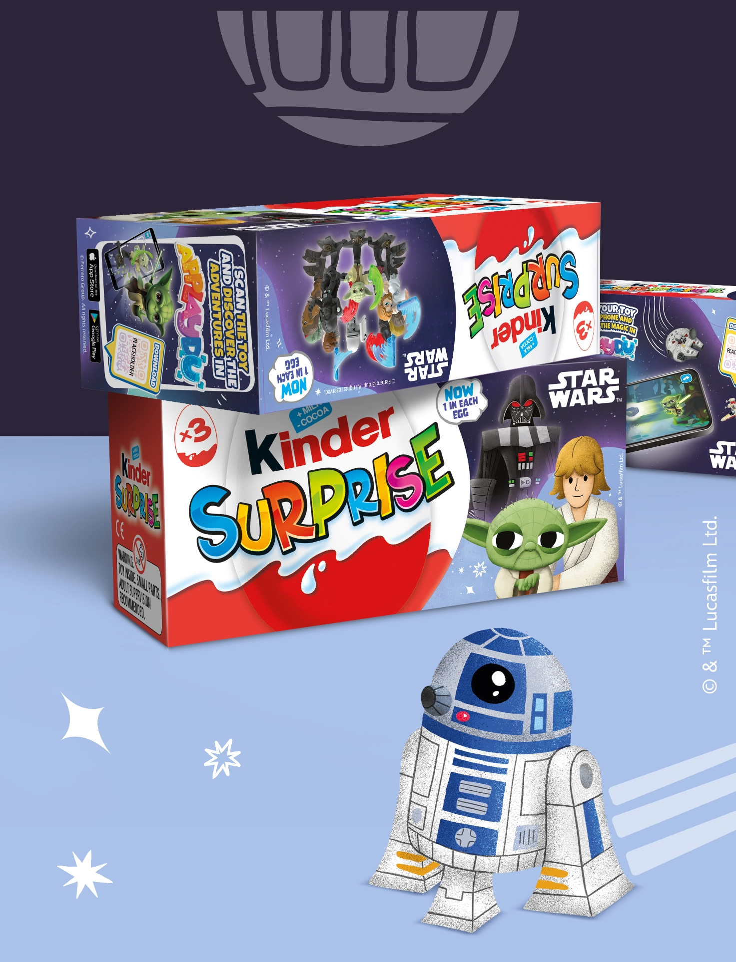
Starting from the Star Wars key visual, the project required significant packaging adaptation and graphic coordination across different supports and formats.
The project involved:
graphic development of Kinder Surprise and Kinder Joy packaging
integration of the key visual and character assets
management of the balance between licence and brand identity
multi-format adaptations
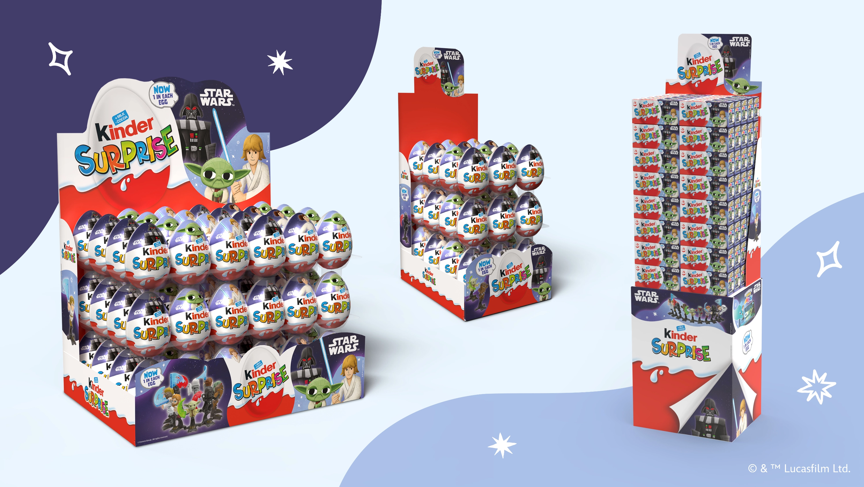
development of retail displays for large-scale distribution
Retail displays were designed as an extension of the packaging, with the aim of maintaining visual continuity and maximising impact at the point of sale.
The collaboration with Ferrero continues through projects that require not only creativity, but also great precision in managing brand identities and licences.
Working with a universe like Star Wars means dealing with powerful visual codes, shared cultural imagery and extremely high expectations. Bringing it into an iconic product like Kinder means finding the perfect balance between attractiveness, recognition and brand consistency.
The most interesting challenge was exactly this: not allowing one universe to dominate the other, but finding a way for them to coexist within packaging capable of telling both stories. A team effort in which dialogue with the Kinder Ferrero marketing team is crucial and highly stimulating for the success of the project.
 Subscribe to the newsletterA dose of yellow, every now and thenSubscribe to the newsletterA dose of yellow, every now and thenSubscribe to the newsletterA dose of yellow, every now and thenSubscribe to the newsletterA dose of yellow, every now and thenSubscribe to the newsletterA dose of yellow, every now and thenSubscribe to the newsletterA dose of yellow, every now and thenSubscribe to the newsletterA dose of yellow, every now and thenSubscribe to the newsletterA dose of yellow, every now and thenSubscribe to the newsletterA dose of yellow, every now and thenSubscribe to the newsletterA dose of yellow, every now and thenSubscribe to the newsletterA dose of yellow, every now and thenSubscribe to the newsletterA dose of yellow, every now and then