In packaging design, working on an iconic product means finding the right balance between brand identity and the power of licensed properties.
For Estathé Ferrero, the project dedicated to the Pokémon and Minions brick bottles began from exactly this challenge: turning already iconic packaging into an even more engaging visual experience, capable of enhancing the product on shelf, remaining immediately recognisable and involving the kids target without losing consistency or brand recognition.
A graphic development project designed to turn every bottle into a small collectible object.
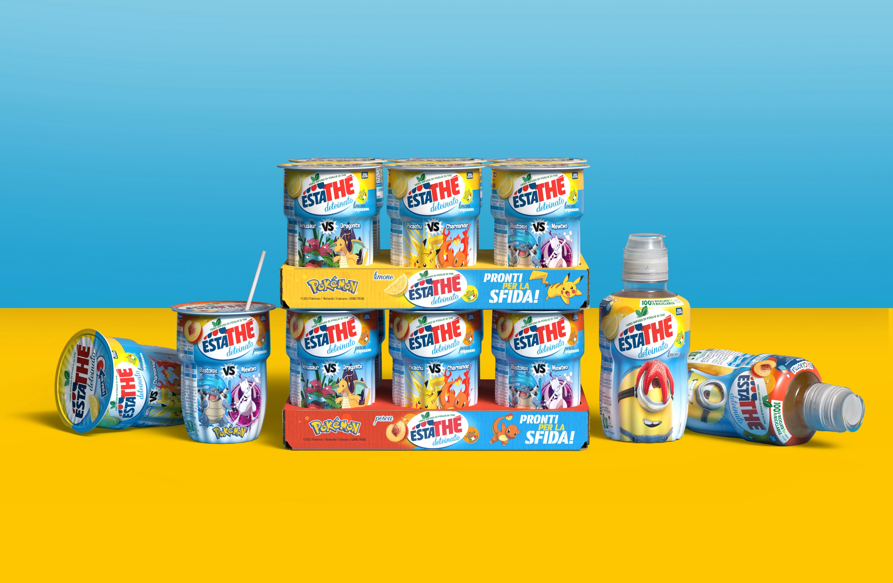
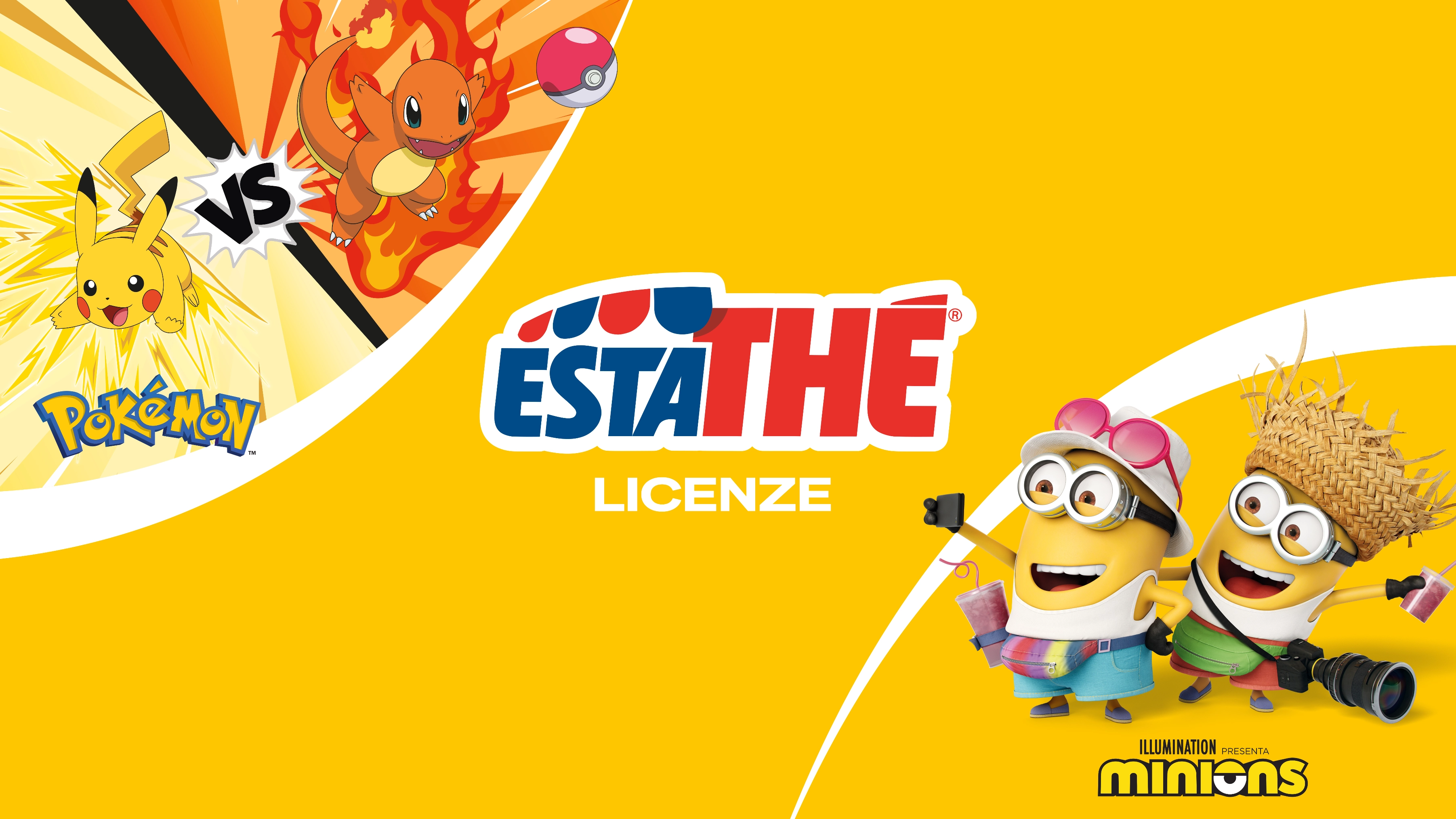
Once the official Pokémon and Minions licence materials were received, the work focused on integrating them into the Estathé visual system.
The objective was to build packaging capable of highlighting the licensed characters while maintaining strong recognition of the Estathé brand. Ensuring visual consistency across the different references and increasing shelf impact and visibility were central to the project, turning the product into something collectible and designed for children. Every graphic choice was developed to find the right balance between entertainment, readability and brand identity.
The project involved adapting the licensed graphics to Estathé brick bottles, applying characters, colours and visuals to a complex three-dimensional surface.
Layouts, hierarchies and placements were designed to enhance both product and licence at the same time, while maintaining continuity across the different variants. The pack thus becomes part of a broader narrative: not a simple container, but a visual communication tool capable of attracting attention, creating engagement and strengthening the emotional connection with young consumers.
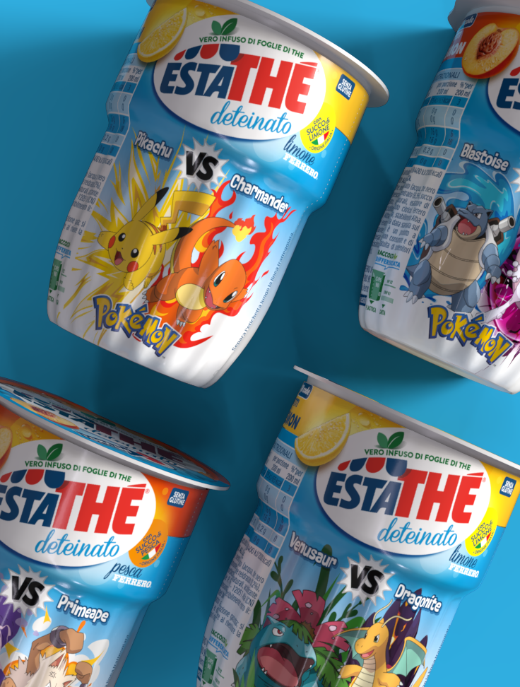
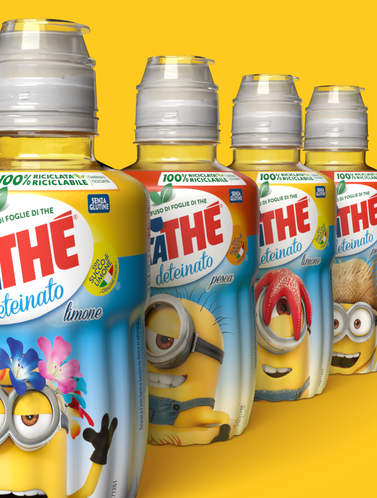
The work started by adapting the official Minions and Pokémon assets to create a packaging range capable of working seamlessly with the Estathé universe.
The project involved:
development and adaptation of licensed graphics
brick bottle graphic design
layout and visual hierarchy design
integration of the Estathé brand identity
colour coordination across variants
graphic consistency and readability checks
Every detail was designed to maintain the balance between the narrative strength of the licences and immediate product recognition.
Working with Estathé Ferrero means approaching every project with great attention to detail, especially when global licences with such strong recognition meet an equally strong and well-positioned brand identity.
The most interesting part of the work was maintaining balance between different visual worlds, respecting precise guidelines without losing freshness, energy or shelf impact. Because when packaging, brand and imagery begin to work together, the product stops being simply a drink and becomes something people look for, choose and remember.
 Subscribe to the newsletterA dose of yellow, every now and thenSubscribe to the newsletterA dose of yellow, every now and thenSubscribe to the newsletterA dose of yellow, every now and thenSubscribe to the newsletterA dose of yellow, every now and thenSubscribe to the newsletterA dose of yellow, every now and thenSubscribe to the newsletterA dose of yellow, every now and thenSubscribe to the newsletterA dose of yellow, every now and thenSubscribe to the newsletterA dose of yellow, every now and thenSubscribe to the newsletterA dose of yellow, every now and thenSubscribe to the newsletterA dose of yellow, every now and thenSubscribe to the newsletterA dose of yellow, every now and thenSubscribe to the newsletterA dose of yellow, every now and then