In retail, the point of sale is where the brand stops being only communication and becomes a real experience.
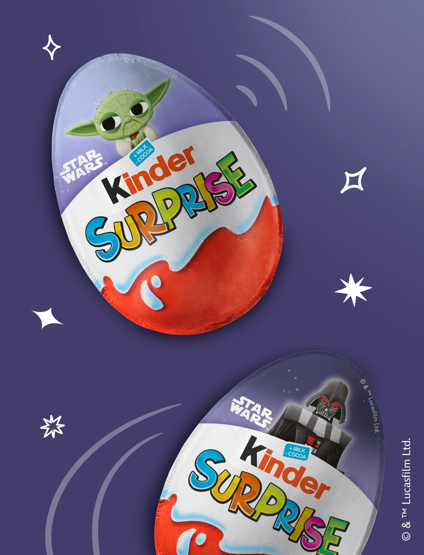
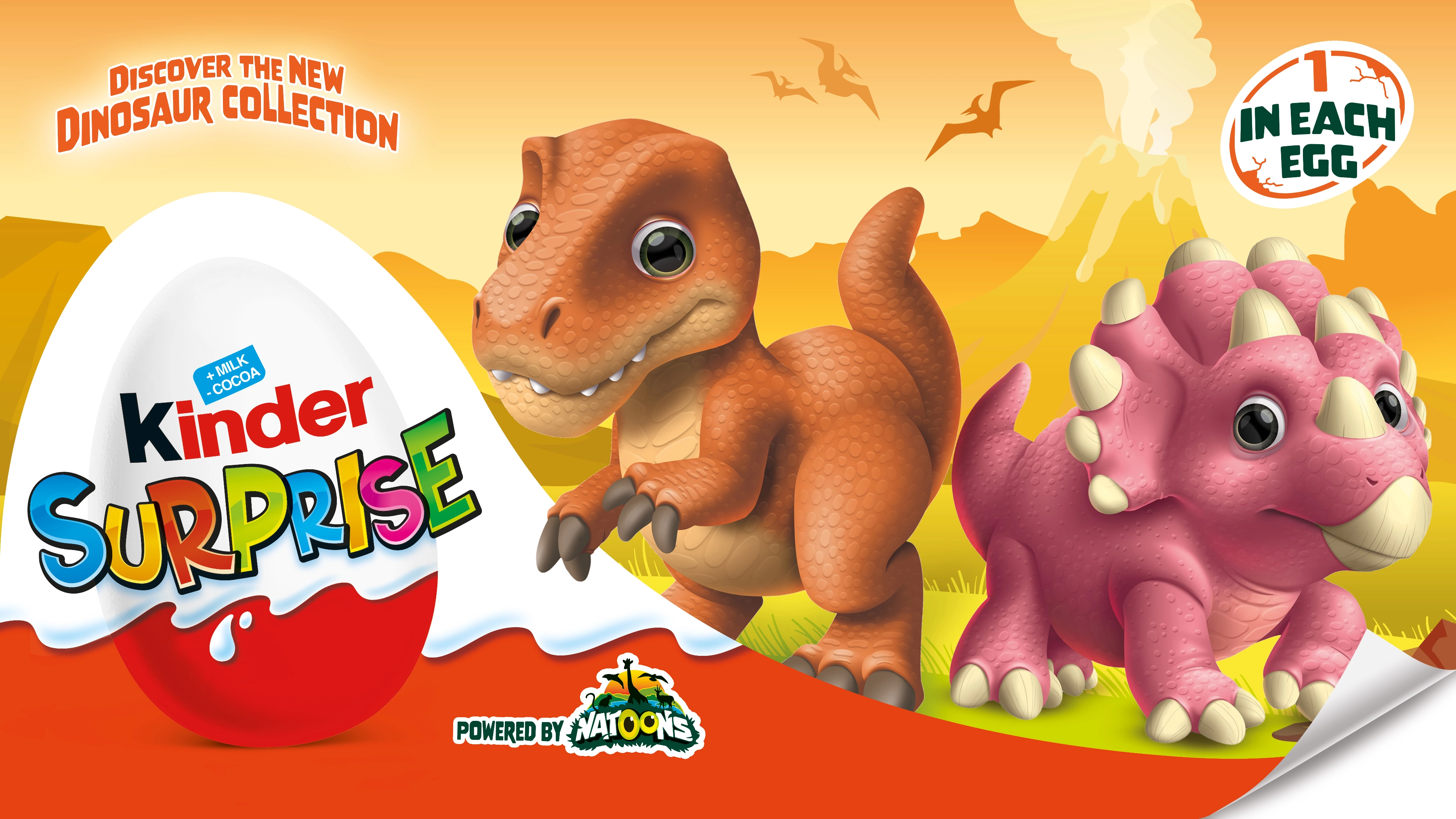
For Kinder Ferrero, the project dedicated to the Natoons Dinosaurs range initially began with the development of packaging for Kinder Surprise and Kinder Joy: the objective was to build a range capable of communicating the Natoons Dinosaurs world in an immediate, engaging and recognisable way.
From there, the project evolved into a complete system of point-of-sale materials, designed to give continuity to the brand’s visual imaginary and turn the key visual into a genuine retail experience.
A project of graphic adaptation and visual merchandising built to strengthen the Kinder range directly within the retail environment.
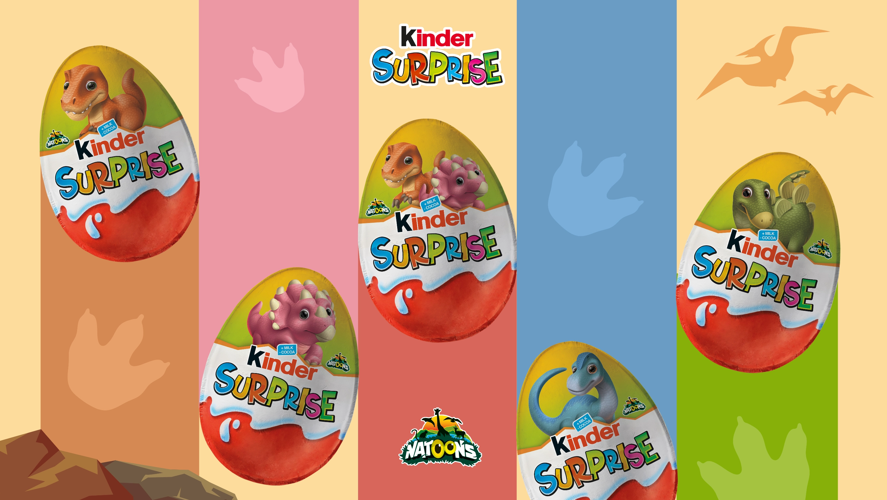
The project began with the development of the Natoons Dinosaurs packaging range. The objective was to create packs capable of enhancing the product while also building a strong and recognisable imaginary for children and families.
Once the visual language of the pack had been defined, the challenge moved into retail, transforming that narrative universe into a coherent system of POP materials capable of working on multiple levels. In short, the objectives were to:
brand iconic product references - Kinder Surprise and Kinder Joy
enhance the product on shelf
strengthen recognition of the Kinder range
maintain continuity between packaging and retail communication
ensure readability and immediate visual impact engage children and families
Every element had to contribute to one coherent visual story, from the pack through to the point-of-sale experience.
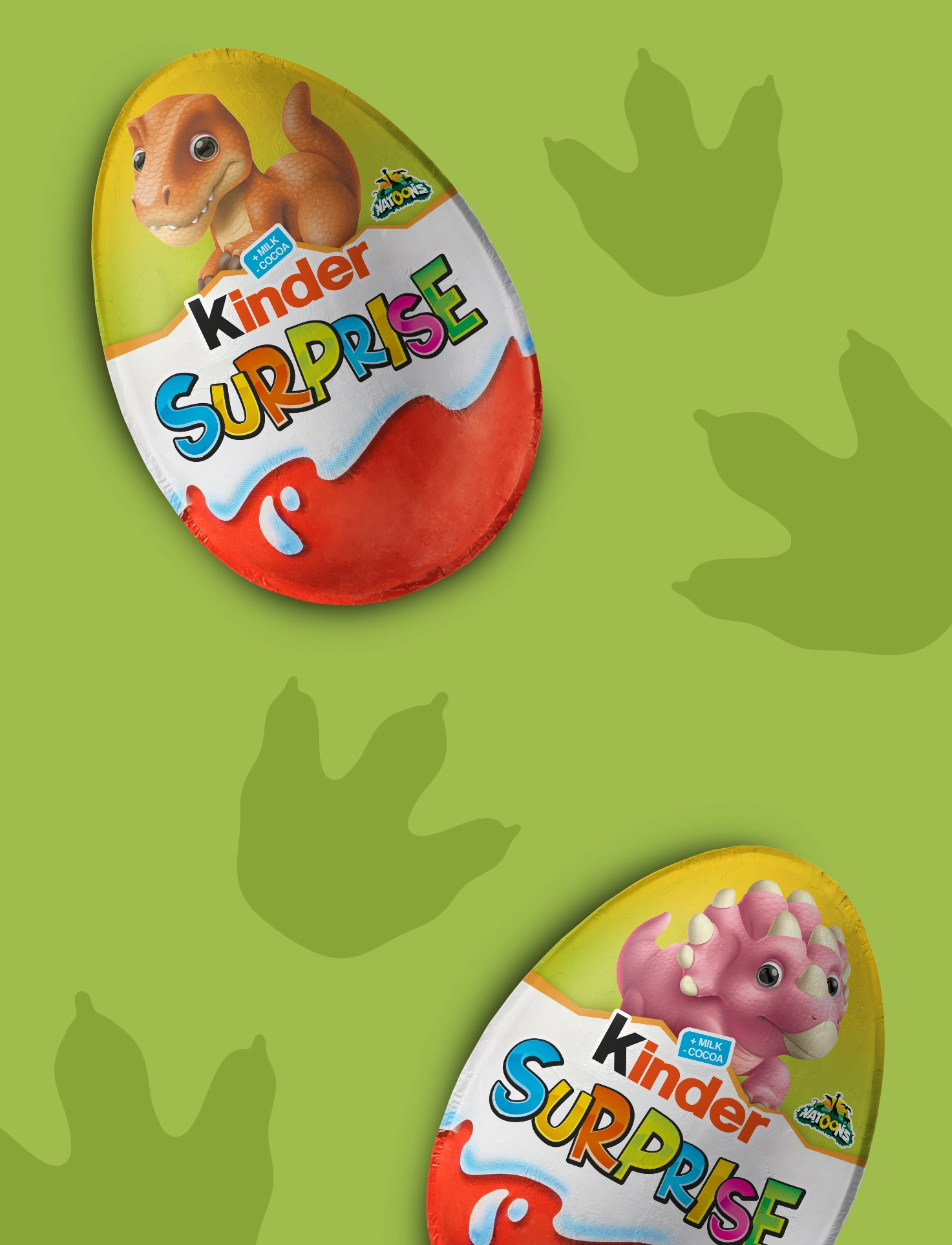
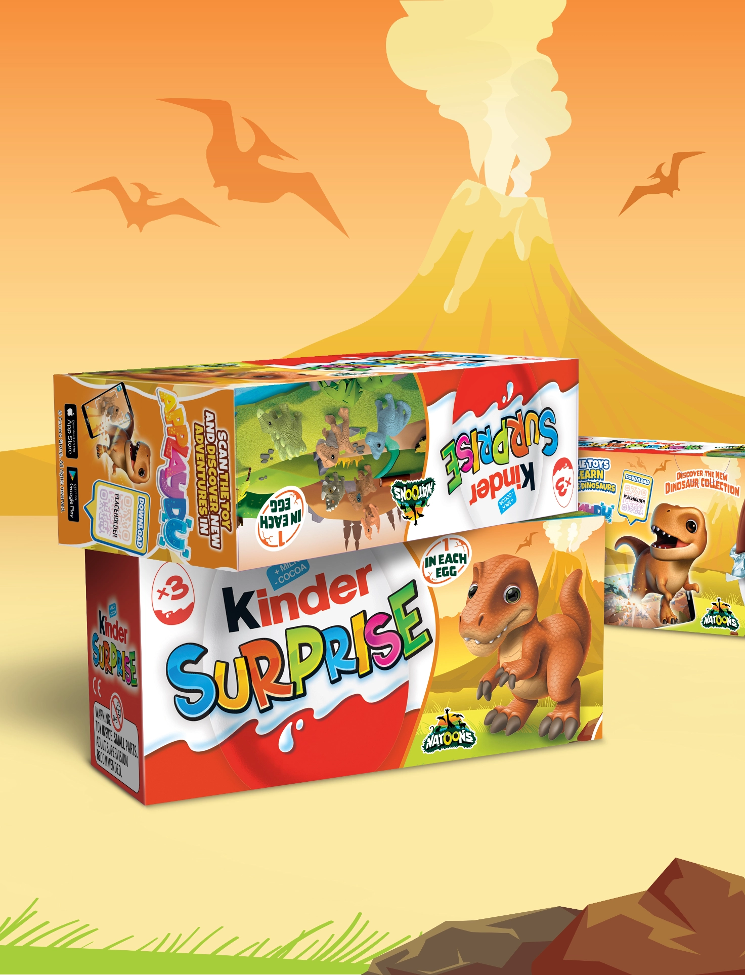
The dinosaur illustrations become the common thread running through the entire project. The work developed on the packaging defined the visual language of the range: colours, characters, hierarchies and narrative atmosphere from the packs were then transferred and expanded across retail communication.
Displays, panels and POP materials were designed to turn the shelf into a narrative space consistent with the Natoons world. Each support works as a natural extension of the pack, maintaining recognition and visual continuity across different formats, sizes and materials.
When packaging and retail start speaking the same language, the brand becomes much more memorable.
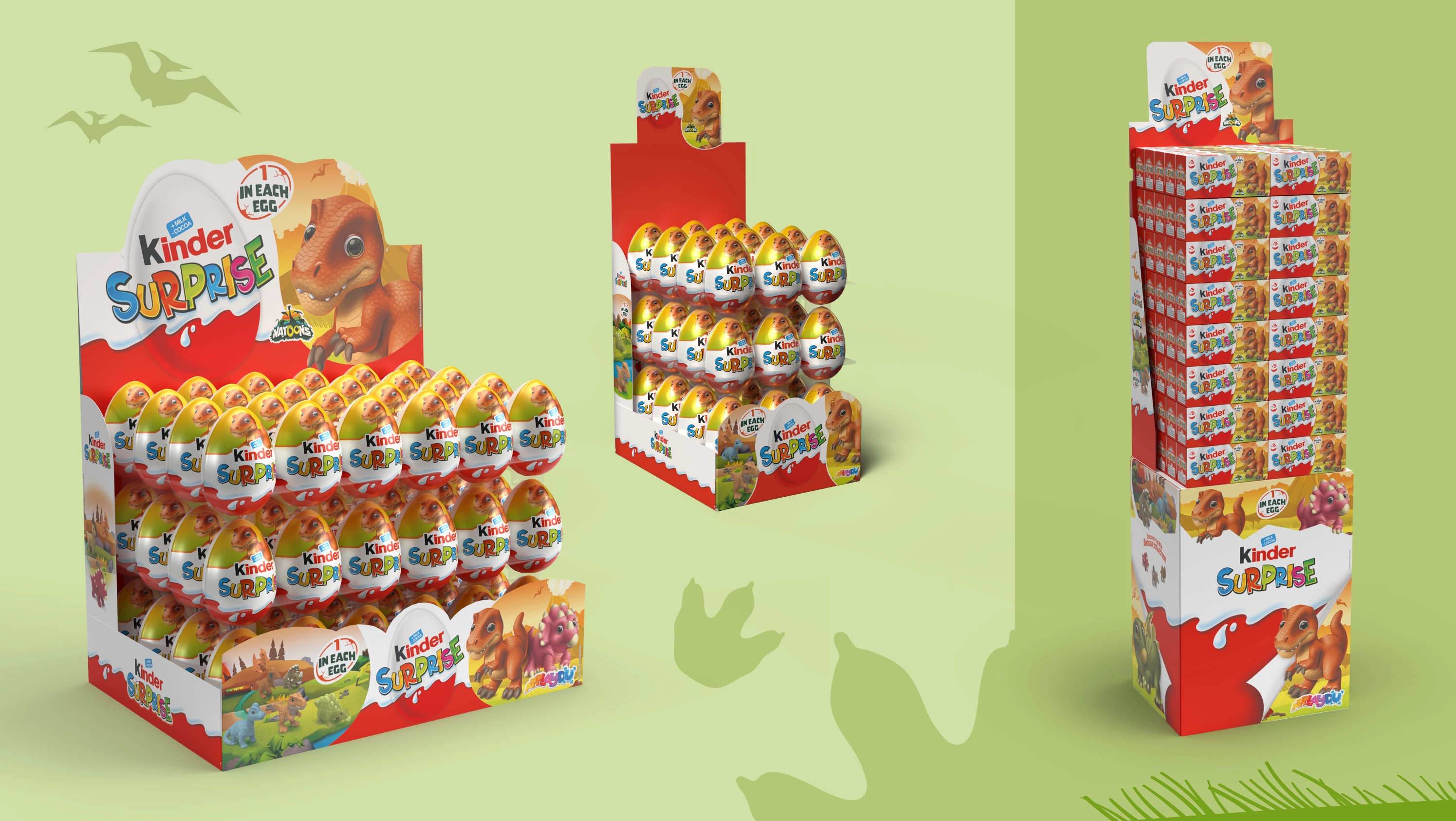
The work started with the design of the Natoons Dinosaurs packaging range and then expanded into retail communication and point-of-sale materials. Every asset was designed to maintain coherence, recognisability and narrative strength, adapting the dinosaur universe to different formats, dimensions and functions.
The project involved:
graphic development of Kinder Surprise and Kinder Joy packaging
adaptation and development of the key visual
point-of-sale material design
graphic development of displays
POP supports and retail materials
visual coordination of the entire range
Every element was designed to strengthen the brand presence and ensure continuity between packaging, product and point-of-sale communication.
Collaborating with Kinder Ferrero means working within an extremely structured system where every detail matters.
The most interesting part of the project was maintaining energy, playfulness and visual impact within a technically precise and rigorous framework. Every adaptation, proportion and graphic development must meet high standards without losing freshness, narrative energy or communication immediacy.
Working with the Kinder marketing team is always an experience of dialogue, growth and shared attention to detail.
 Subscribe to the newsletterA dose of yellow, every now and thenSubscribe to the newsletterA dose of yellow, every now and thenSubscribe to the newsletterA dose of yellow, every now and thenSubscribe to the newsletterA dose of yellow, every now and thenSubscribe to the newsletterA dose of yellow, every now and thenSubscribe to the newsletterA dose of yellow, every now and thenSubscribe to the newsletterA dose of yellow, every now and thenSubscribe to the newsletterA dose of yellow, every now and thenSubscribe to the newsletterA dose of yellow, every now and thenSubscribe to the newsletterA dose of yellow, every now and thenSubscribe to the newsletterA dose of yellow, every now and thenSubscribe to the newsletterA dose of yellow, every now and then